A brand that brings people and technology together.
- Client
- Clanizon
- Industry
- IT consulting and software
- Country
- India
- Services
- Brand identity, Brand guidelines, Collateral
- Timeline
- 3 weeks, 2024
Creative direction and design: Preethika Asokan
(Snapshot)
- 4ideas in one symbol: human, clan, on, tech
- 8colours in two moods, tech and warmth
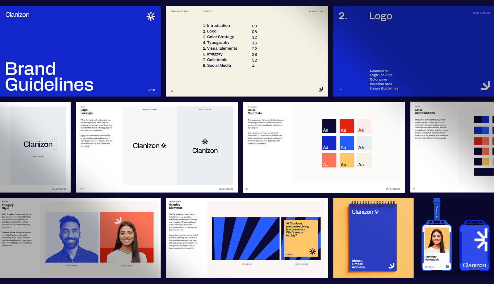
- 8chapters in the brand guidelines
- 3weeks from brief to brand guidelines
The challenge.
Clanizon is a Chennai IT company that builds web, mobile, and cloud products for businesses. The team was growing and winning work, but the brand had not kept up. It had a basic logo and no real identity behind it: no clear colours, no type system, and no rules for how the company should look.
For an IT company, that matters. Clients judge a tech partner by how professional it looks, long before the first call. Clanizon needed a brand that felt modern and trustworthy, and that showed what makes it different: a close team that solves problems together.
- Weak identity. A basic logo with nothing to support it.
- No consistency. No colours, fonts, or rules, so every document and post looked different.
- No story. The brand didn’t say anything about the people or the way they work.
What we did.
We started with the name. “Clanizon” is about a clan, a close group of people, working with technology. We built the whole identity around that idea. Here are the key decisions.
-
01A symbol built from the name
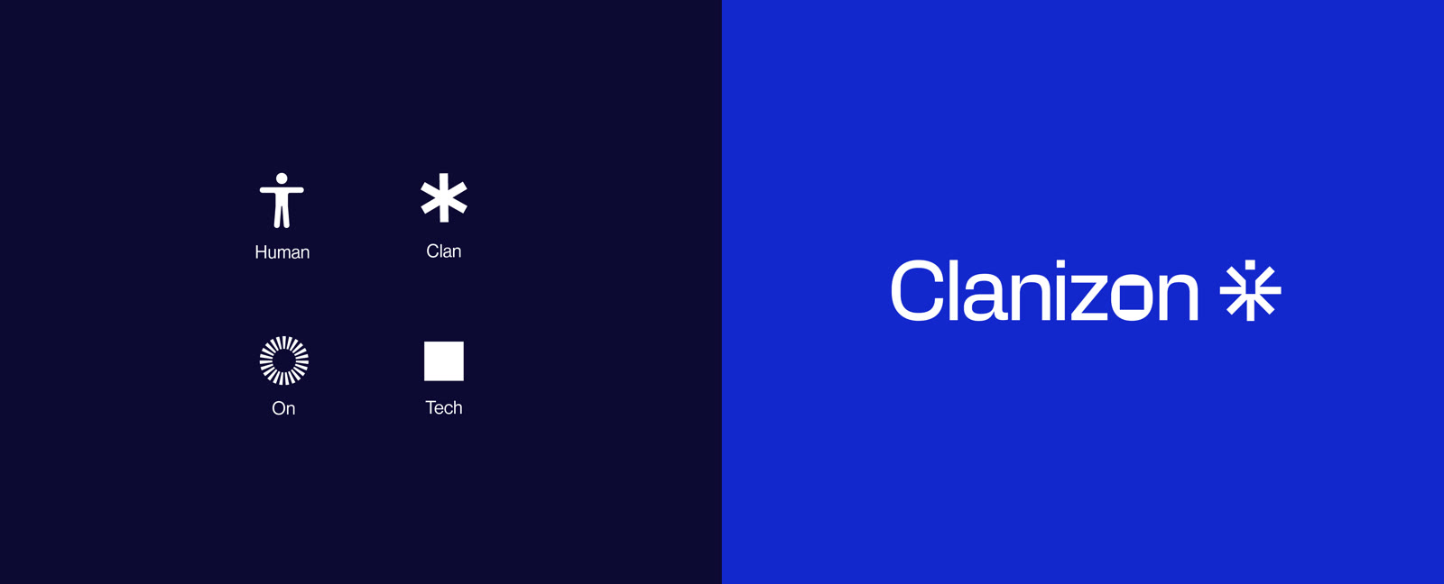
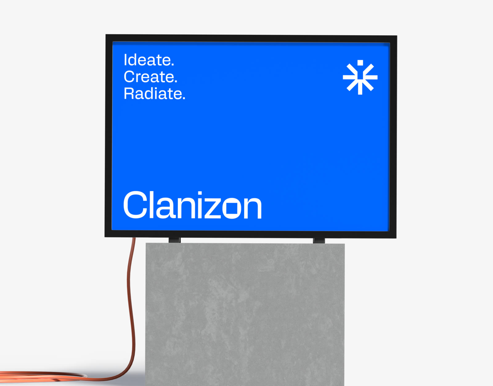
The Clanizon symbol combines four simple ideas: a human with open arms, an asterisk for the clan coming together, radiating lines for “on”, and a square pixel for tech. Together they form one bold mark that shows people and technology as one.
-
02A wordmark with a tech detail
In the wordmark, the “o” in Clanizon is a squared shape that echoes the pixel in the symbol. It’s a small detail, but it ties the name and the mark together and gives the brand a clear tech feel.
-
03Two colour moods
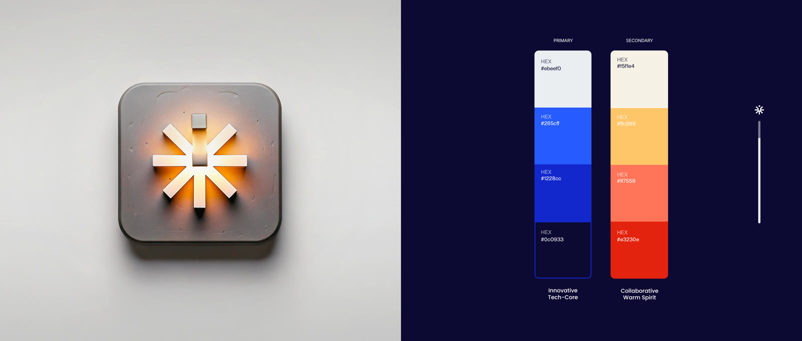
The palette has two sides. “Innovative Tech-Core” blues bring trust and technology. “Collaborative Warm Spirit” yellows, oranges, and reds bring the human side. Tested pairings and contrast rules keep them working well together.
-
04A bold, modern voice
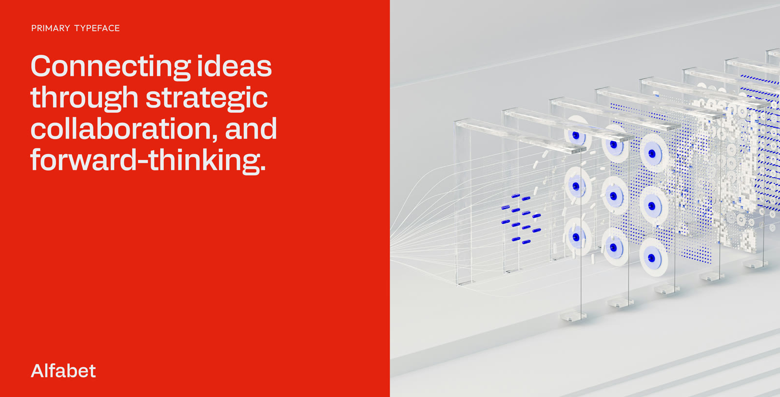
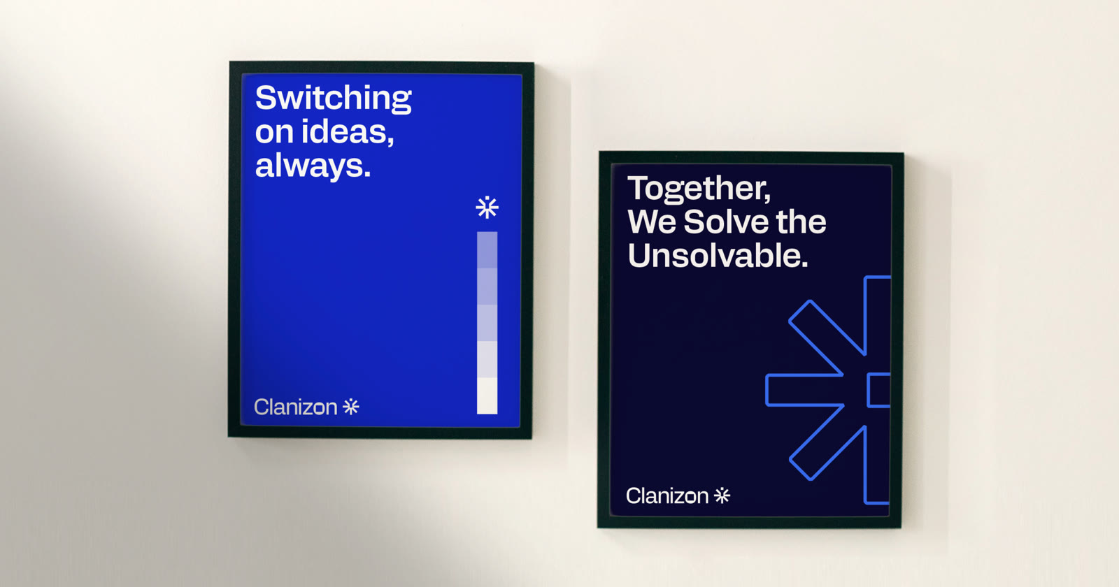
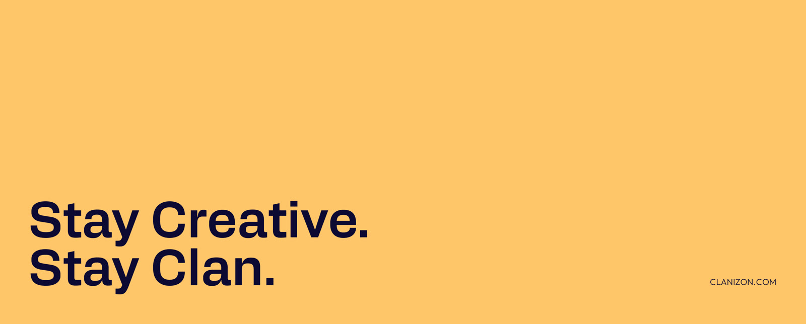
We chose Alfabet as the main typeface: clean, strong, and easy to read. We paired it with short, confident lines like “Together, We Solve the Unsolvable.” and “Switching on ideas, always.”, so the brand sounds as clear as it looks.
-
05A kit of shapes from the logo
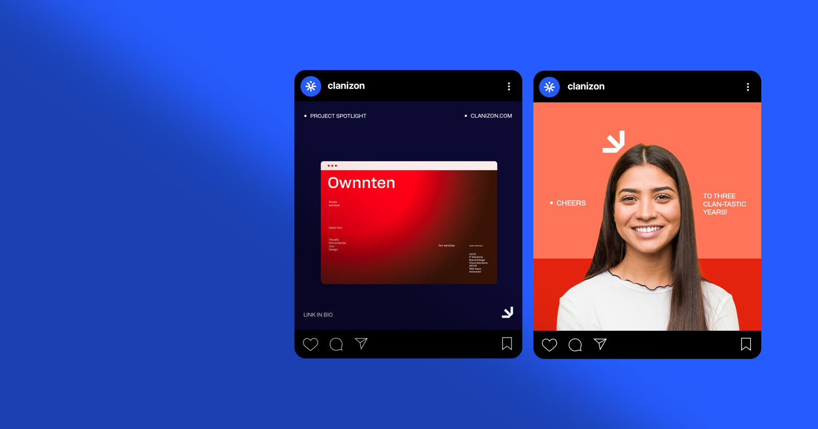
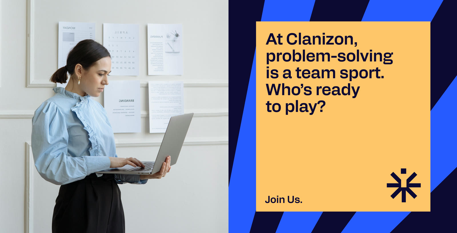
Every graphic element comes from the symbol: a dynamic arrow, a radiating Tech-Beam pattern, and a blue colour overlay for team photos. With these, any post, poster, or slide instantly looks like Clanizon.
-
06Everything ready from day one
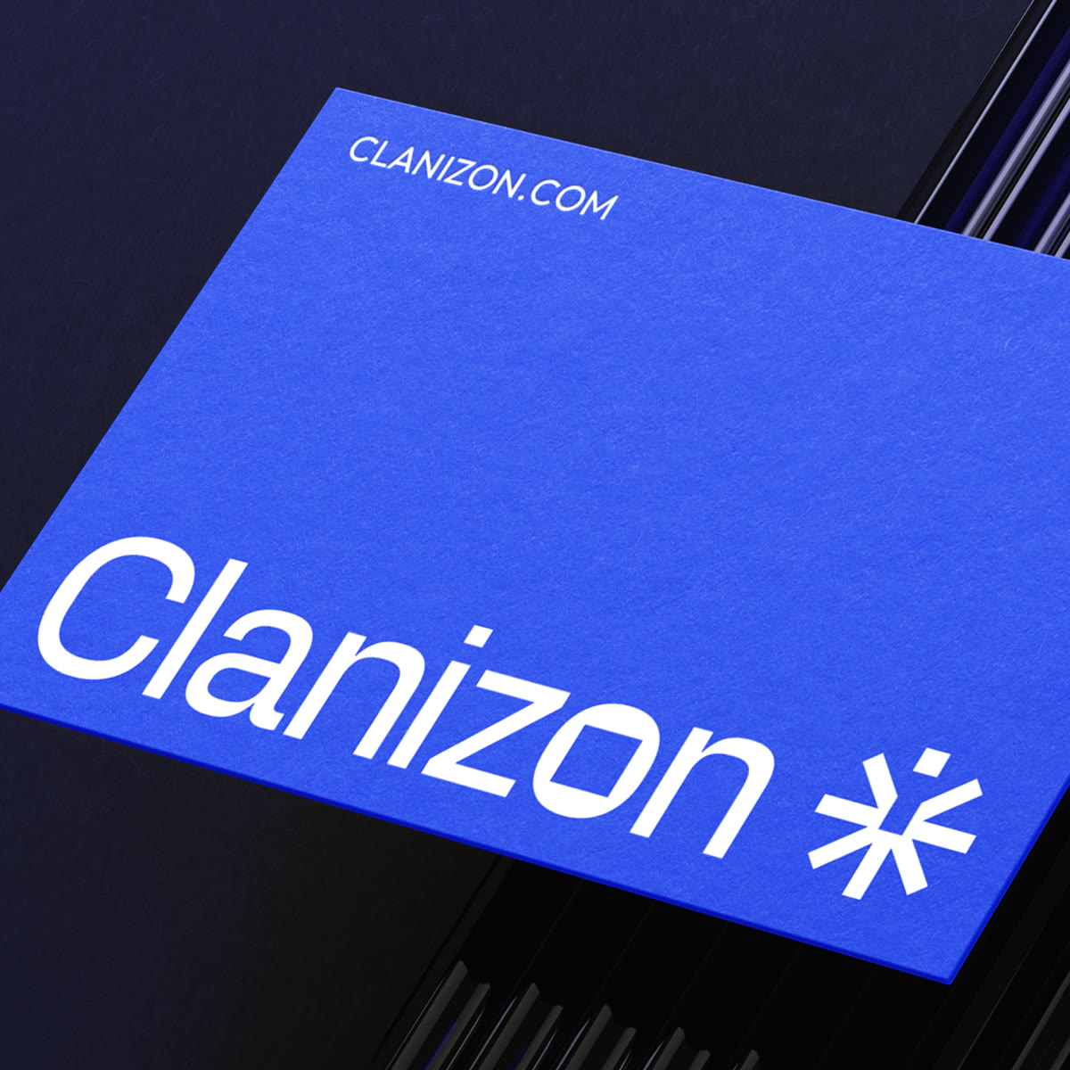
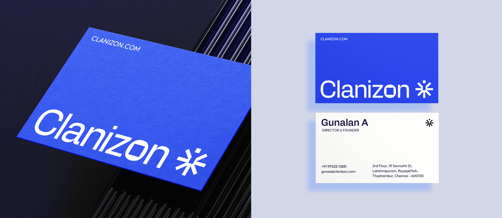
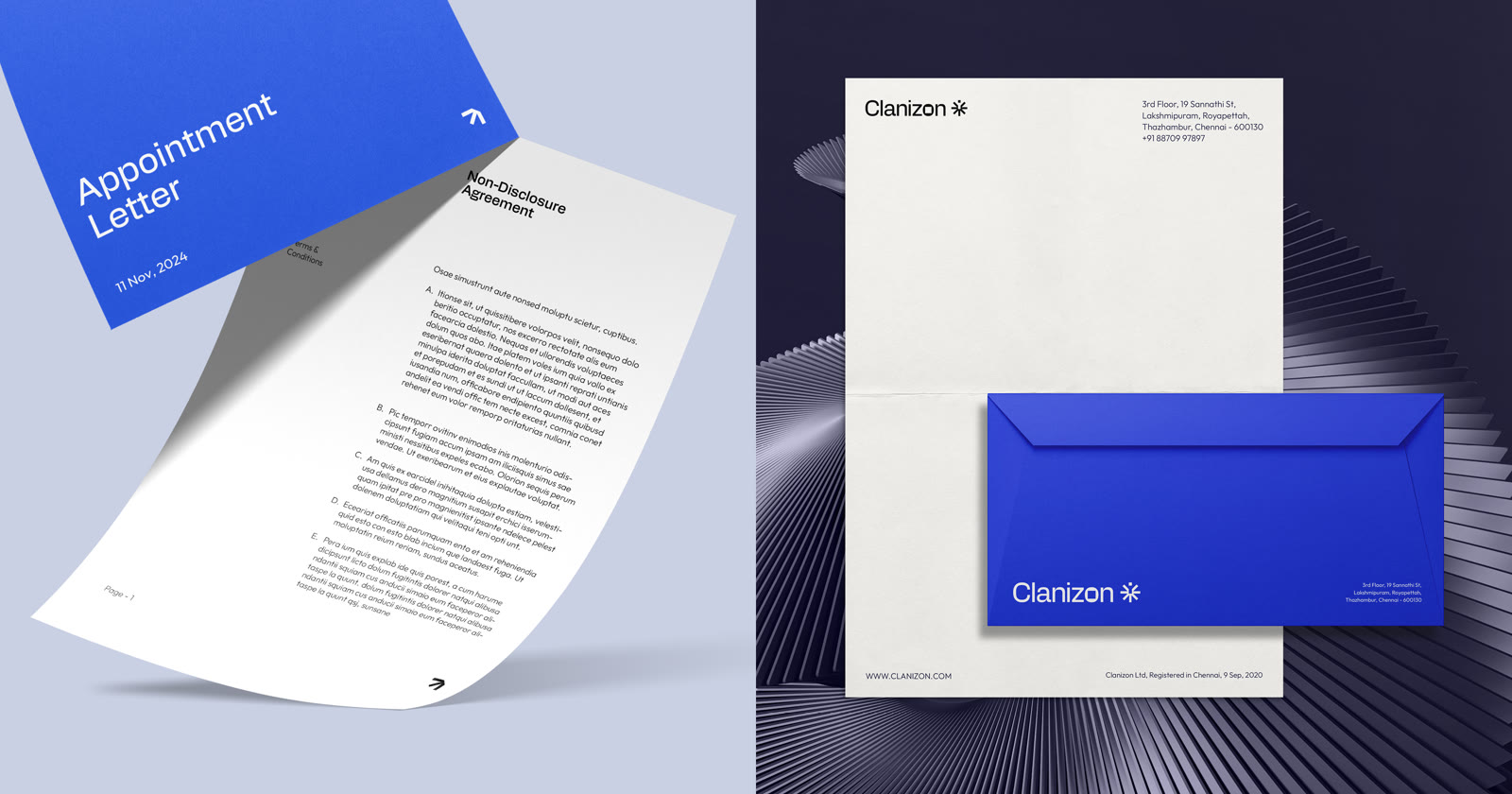
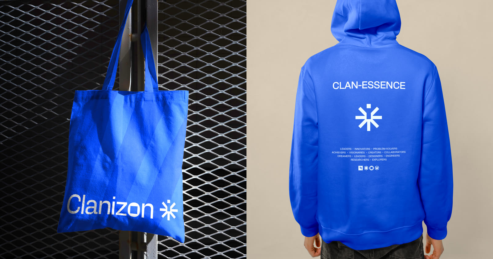
We designed the full set of everyday pieces: business cards, letterheads, envelopes, email signatures, social media templates, posters, ID cards, and merchandise. The brand guidelines bring it all together, so the team can use the brand correctly from the start.

The result.
- 1complete brand system, from symbol to merchandise
- 3weeks from brief to final guidelines
Clanizon now has a brand that looks as capable as the team behind it. From business cards to social posts, everything now looks consistent and professional, and the brand finally tells the story of a close team that solves problems together.
Gunalan’s story, first hand. Coming soon.
What we delivered.
- Logo symbol and wordmark
- Logo lockups: horizontal and vertical
- Colour palette with pairings and contrast rules
- Typography system
- Graphic elements: arrow and Tech-Beam pattern
- Imagery style
- Brand guidelines document, 8 chapters
- Business cards
- Letterheads and envelopes
- Email signatures
- Social media templates
- Posters
- ID cards
- Merchandise: tote bag and hoodie
More case studies.

(Start a project)
Want results like this?
Tell us what you’re building. We reply within 24 hours.