01
Brand
Camel is a global design studio from Madurai, since 2023. We partner with startups and growing companies to design and build their websites, products and brands.
A camel crosses any desert. We help brands cross any market.
What we stand for
Senior craft as standard.
Real experience on every project, not juniors learning on a client’s budget.
One team, idea to launch.
Design and engineering under one roof, so nothing breaks in the handoff.
A proven method.
The same path every time, so quality never depends on luck.
How we work
Understand the business, the users and the market before a single pixel.
Design and build in short, visible steps, with the client in the loop.
Launch, measure and hand over something the team can grow on.
Key lines
| Line | Where to use it |
|---|---|
| Built to cross any market. | Main tagline. Homepage hero, footer sign-off, cover slides. |
| Global design studio from Madurai. | Short description: bios, social profiles, email signatures. |
| One proven method, every market. | Method and process content. |
| Want results like this? | Closing call to action after work and case studies. |
02
Voice
We sound like a senior designer talking to a founder: clear, warm and confident. Short sentences, plain English, no buzzwords. We show proof instead of making claims.
Clear
Say it the simple way. If a 15-year-old can’t follow it, rewrite it.
Warm
Talk to one person. “You” and “we”, never “the user” or “the agency”.
Confident
No hype, no exclamation marks. Real numbers and real work do the talking.
- “We reply within 24 hours.”
- “Senior designers on every project.”
- Use the client’s own words in quotes, word for word.
- Commas, full stops and colons to join ideas.
- UK spelling: colour, organise, centre.
- Em dashes. Ever. Use a comma, colon or full stop.
- “World-class, cutting-edge, synergy, best-in-class.”
- A client’s numbers (users, revenue) shown as our results.
- Made-up quotes or testimonials.
- Saying we “built” or “developed” when we only designed.
03
Logo
The logo is the camel mark with the “camel design” wordmark. Use the files below as they are: never redraw, recolour, stretch or add effects. The mark alone is for small spaces like avatars, app icons and favicons.
Versions
Vector files (SVG): sharp at any size, for web, slides and print. The horizontal logo is the default. Use the vertical one in square or tall spaces, and the mark alone where space is tight. The ® is left off on screen; the original files with ® are kept for legal and trademark use.
Horizontal, cream on blackSVG
Horizontal, maroon on lightSVG
Horizontal, black on yellowSVG
Vertical, creamSVG
Wordmark onlySVG

White, on photos and colourSVG
Mark, yellowSVG
Mark, maroonSVG
Walking mark, for playSVG
Every logo comes in black, white, cream (#EDE5D8) and maroon (#491D1B). The marks also come in yellow.
Clear space and size
xxClear space: keep an empty margin around the logo equal to x, the height of the mark’s head (about a fifth of the logo’s height). Nothing goes inside it: no text, edges or other logos.
Minimum size: the full logo at least 96px wide on screen and 25mm wide in print. Below that, use the mark alone (at least 24px).
Website header: 132px wide.
Don’t
Stretch or squash it
Change its colours
Rotate it
Use low contrast
04
Colour
Black and white do most of the work. Yellow is the spark: buttons, highlights and the one thing you should look at. The desert colours (terra, tan, sand) and the blues give warmth and variety to blocks and project tiles. Click any colour to copy its hex code.
Core
Supporting
Every colour, for screen and print
HEX and RGB for screens. CMYK for print. The Pantone column is the closest match: always check it against a printed Pantone guide and a test print before a big run.
| Colour | HEX | RGB | CMYK | Pantone (closest) |
|---|---|---|---|---|
| Black | #0E0E0E | 14 14 14 | 0 0 0 95 Rich black for big areas: 60 40 40 100 | Black 6 C |
| White | #FFFFFF | 255 255 255 | 0 0 0 0 Paper white, no ink | – |
| Paper | #F5F4F1 | 245 244 241 | 0 0 2 4 | Cool Gray 1 C (light tint) |
| Yellow | #FFF04F | 255 240 79 | 0 6 69 0 | 101 C |
| Yellow soft | #FFF6A8 | 255 246 168 | 0 4 34 0 | 100 C (tint) |
| Blue | #3B63C2 | 59 99 194 | 70 49 0 24 | 7455 C |
| Blue soft | #A8C7FA | 168 199 250 | 33 20 0 2 | 2717 C |
| Terra | #AB5E3D | 171 94 61 | 0 45 64 33 | 7592 C |
| Tan | #DEB295 | 222 178 149 | 0 20 33 13 | 4745 C |
| Sand | #EDD2C0 | 237 210 192 | 0 11 19 7 | 7604 C |
| Grey | #D6D6D6 | 214 214 214 | 0 0 0 16 | Cool Gray 2 C |
| Logo maroon | #491D1B | 73 29 27 | 0 60 63 71 | 4975 C |
| Logo cream | #EDE5D8 | 237 229 216 | 0 3 9 7 | 7527 C (tint) |
Balance
Roughly how much of each colour a page or layout should hold. Yellow stays small so it keeps its power.
Safe text pairings
05
Typography
Two typefaces. Hanken Grotesk carries every word you read. Bitcount Grid Single, the pixel font, is the accent: big titles only, about one per screen. Both are free (SIL Open Font License) on Google Fonts.
Aa
Primary, all text
Hanken Grotesk
Regular 400, Medium 500, Semibold 600
ABCDEFGHIJKLMNOPQRSTUVWXYZ
abcdefghijklmnopqrstuvwxyz 0123456789
Aa
Accent, big titles
Bitcount Grid Single
ABCDEFGHIJKLMNOPQRSTUVWXYZ
abcdefghijklmnopqrstuvwxyz 0123456789
Pixel font settings
Always ELSH 50 (square pixels) and weight 400. Never lower the weight. Tight spacing: letters -0.03em, words -0.2em, line height 1.02 to 1.08.
Camel
ELSH 0Camel
ELSH 50, in useCamel
ELSH 100Type scale
Our work
Design that moves the business.
Want results like this?
Senior craft as standard.
Real experience on every project, not juniors learning on your budget.
Camel is a global design studio that designs and builds websites, products and brands for growing companies.
(Start a project)
Rules
- Pixel font for page titles, big section titles and the closing call to action.
- Highlight one key word in a yellow block.
- Left-align text. Keep lines under about 70 characters.
- 12px is the smallest text, anywhere.
- Pixel font for paragraphs, buttons, small text or long titles.
- More than one pixel title on the same screen.
- Bold (700+) Hanken for headings; Semibold is the heaviest we use.
- Centred paragraphs, all-caps sentences.
06
Pixel language
The pixel is our signature: the square is the smallest unit of anything digital. We use it in four ways, always as a crisp square, never rounded, never blurred.
Notched corners
Buttons and cards cut one square from each corner. Tags stay plain squares so they never look clickable. No rounded corners.
Pixel staircase
Edges where two areas meet step in square blocks, like a curtain rising.
Pixel type
The pixel font for titles, numbers and moments of play.
Pixel icons
Drawn on a 10 x 10 grid of squares. Yellow on black or black on light.
Icon set
07
Imagery
Three kinds of images: real people, real work and the desert. Warm, natural light. Real team photos only, never stock people presented as our team.

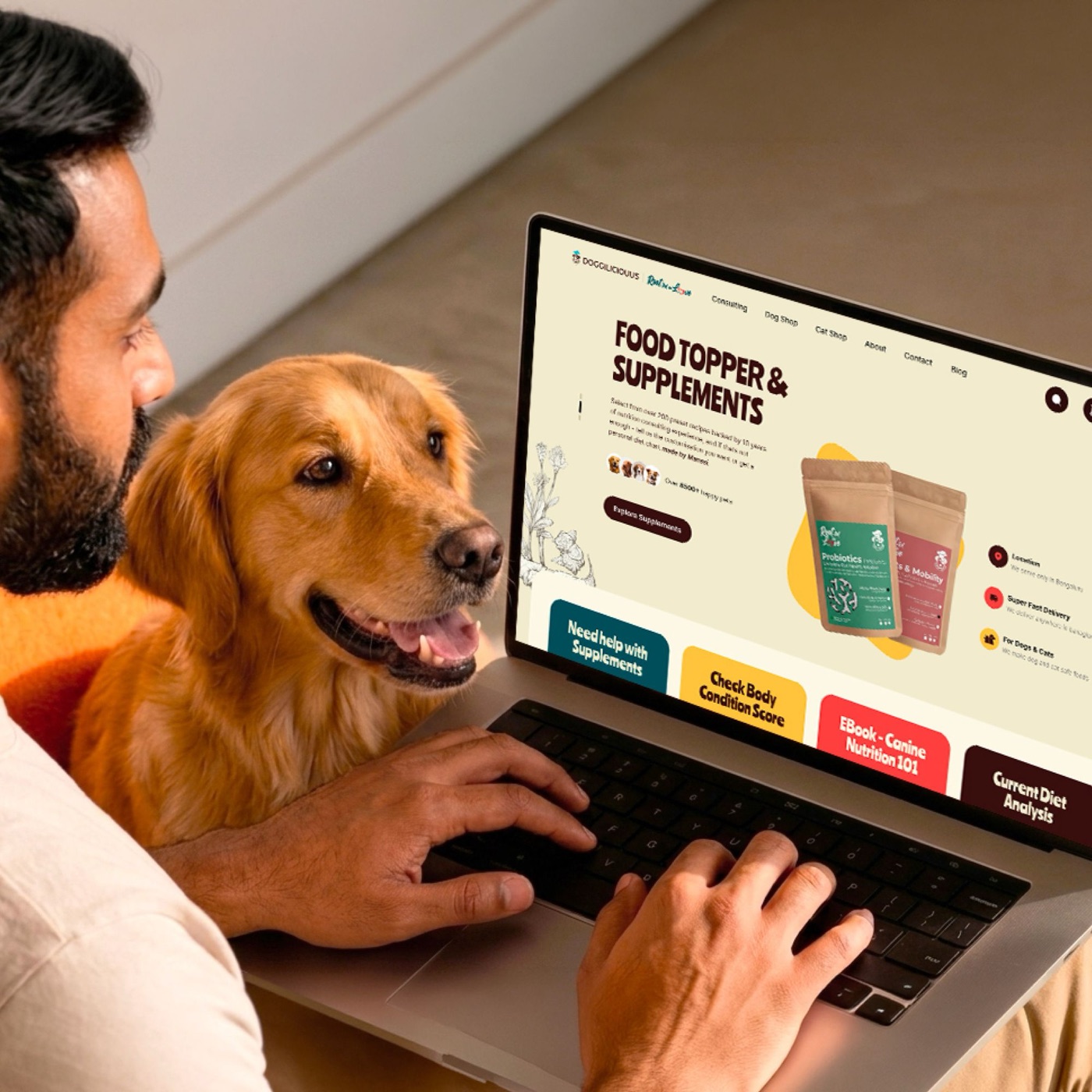
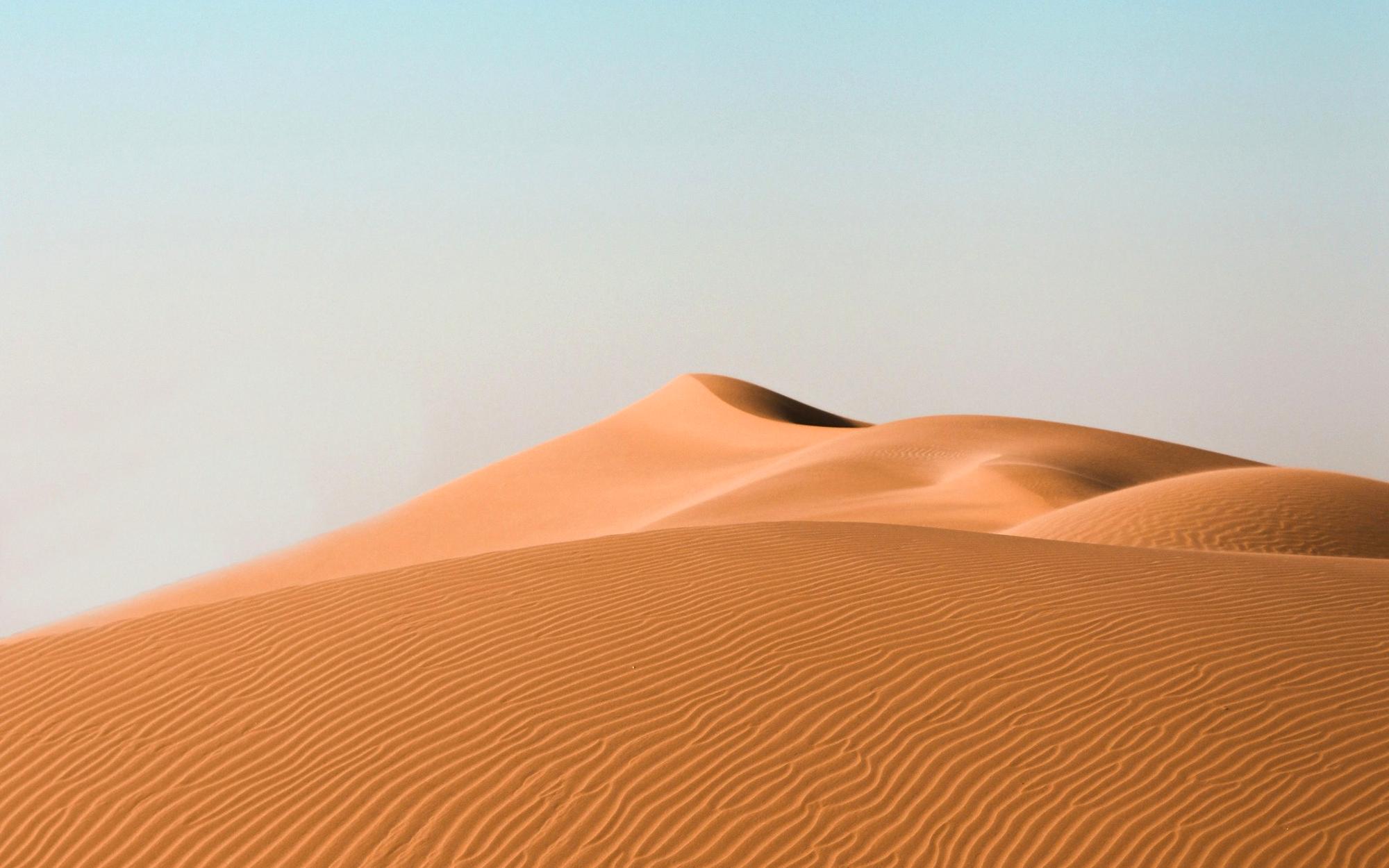
- Square cards: 1200 x 1200 JPG, under 300 KB.
- Wide images: at least 2400px wide for full-width heroes.
- Short videos: muted, H.264 MP4, play 3 times then stop.
- Every image gets a description (alt text).
- Busy stock photos, cold blue office scenes, fake smiles.
- Rounded corners on images.
- Text baked into photos (it can’t be read on phones).
- Filters that change the brand colours.
08
Layout
Mobile first. Sections run edge to edge; content sits inside one shared side margin, so every left edge lines up. Generous space between sections, a thin black line above each new one.
Screens
| Screen | Width | Side margin | Notes |
|---|---|---|---|
| Phone | up to 768px | 24px | Primary screen. One column. |
| Tablet | 769 to 1080px | 24 to 50px | Two columns, menu button in the header. |
| Desktop | 1081px and up | 50px | Full layout, tested to 1920px. |
Spacing scale
Rhythm
16
Title to its intro text: they read as one.
48
Between groups inside a section on phones.
96
Between sections on phones, and heading to content on desktop.
120
Above and below section lines on big screens.
09
Components
The real website pieces, shown live from the site’s own styles. Hover them to see how they behave. One primary button per screen.
Buttons
| Rule | Detail |
|---|---|
| Shape | Square corners with one square notch per corner (6px, 8px on large). |
| Size | At least 44px tall. Semibold label. An arrow only on the main action. |
| Primary | Yellow with black text. On yellow backgrounds: black with white text. |
| Outline | Thin line in the text colour. On hover it fills, and the line disappears. |
Tags and labels
(Start a project)
highlightForm field
Project card
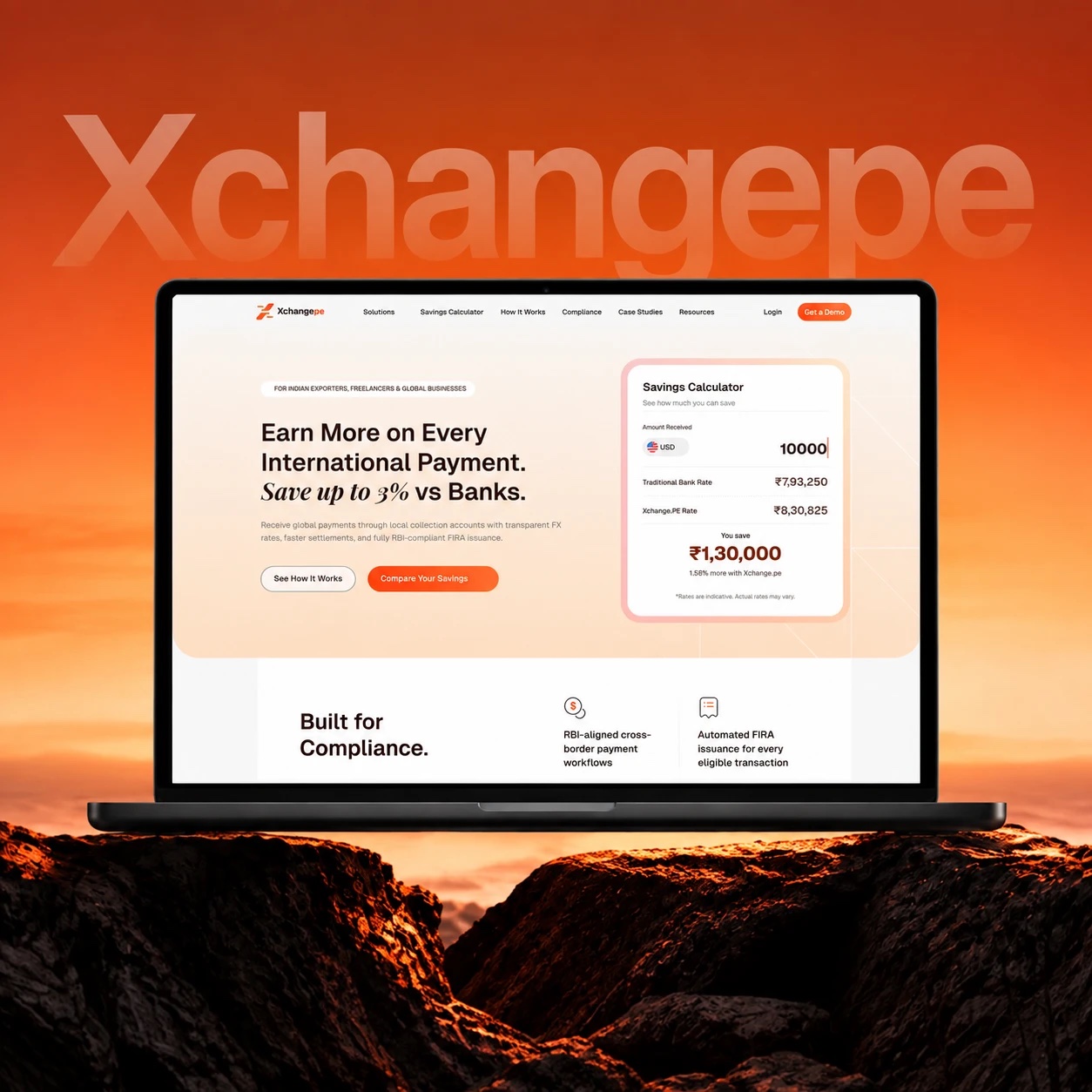
10
Motion
Calm and confident. Things rise gently into place and settle with a soft slow-down. Movement guides the eye; it never shows off. Anything that loops stops on its own.
Hover
0.2 to 0.3s. Arrows nudge 4px, images zoom to 103%.
Reveal
0.5 to 1s. Rise 53px and fade in, staggered 120ms.
Scene
0.6s colour changes, pixel curtains, page transitions.
| Token | Value |
|---|---|
| Brand ease | cubic-bezier(.2, .7, .2, 1) |
| Entrance ease | cubic-bezier(.22, 1, .36, 1) |
| Pixel steps | steps(6), for curtains and the phone menu |
| Loops | Videos and image flips play 3 rounds, then stop (WCAG 2.2.2) |
11
Presentations
Ten slide layouts cover almost every deck: proposals, case studies, pitches and talks. One idea per slide. Black, white and yellow do the work; photos and real numbers carry the proof.
Proposal · October 2026
A new website for Acme.
camel.design
Let’s talk.
jamil@camel.design · +91 87608 03361 · cal.com/cameldesign
Slide rules
| Item | Rule |
|---|---|
| Size | 16 : 9, 1920 x 1080. Export as PDF for sending. |
| Margins | 96px on all sides. Logo top left or bottom right, never both. |
| Titles | Pixel font, 96 to 140px, one per slide, one yellow key word. |
| Text | Hanken Medium, 32px; never under 24px. At most 3 bullet points. |
| Labels | Hanken Semibold, 18px, uppercase, +0.14em. |
| Backgrounds | White or black most of the time; yellow soft for section breaks only. |
| Fonts in Keynote, PowerPoint, Google Slides | Install Hanken Grotesk and Bitcount Grid Single from Google Fonts first. In Google Slides both are in the font menu under “More fonts”. |
13
Print and documents
Everyday pieces in one family: business card, letterhead, proposal and email signature. Print uses the CMYK values from Colour and the vector logos.
Built to cross
any market.
+91 87608 03361
camel.design
Camel Design Studio · Madurai, India · camel.design
Proposal for Acme.
October 2026
Print specs
| Item | Spec |
|---|---|
| Colour | CMYK (values in Colour). Big black areas in rich black 60 40 40 100. |
| Files | PDF (PDF/X-1a), 300 dpi images, fonts outlined or embedded, vector logos. |
| Bleed | 3 mm on every side; keep text 5 mm inside the trim. |
| Business card | 85 x 55 mm, 350 to 400 gsm uncoated, black front, white back. |
| Letterhead | A4, 100 to 120 gsm uncoated. Logo top left, details in the footer, 20 mm margins. |
| Signage | Vector logo only, cream or yellow on black, or black on yellow. |
| Email signature | Name, role, one line of links (camel.design, Book a call, WhatsApp) and the free audit line. Made in the email signature page; copy and paste into Gmail. |
14
Accessibility
Good design works for everyone. We aim for WCAG 2.2 AA on every page and every piece of content.
Contrast
Text at least 4.5 : 1 (3 : 1 for 18px and up). Use the safe pairings in Colour.
Touch
Tap areas at least 44 x 44px on phones and tablets.
Focus
A clear 3px focus frame on everything you can reach with the keyboard.
Text
Never under 12px. Paragraphs at 1.5 line height or more.
Media
Alt text on every image. Moving things stop within about 5 seconds.
Structure
One main title (h1) per page, headings in order, links that say where they go.
15
Checklist
Run through this before anything goes out: a web page, a deck, a social post or a print file.
Brand
- The right logo file for the background, with clear space.
- Only brand colours. Yellow used small, for the one key thing.
- Hanken for text; at most one pixel title per screen.
- Square corners and notches, no rounded corners.
Words and quality
- Plain English, UK spelling, no em dashes.
- Every claim is true and every quote is real, word for word.
- Checked on a phone first, then a laptop.
- Contrast, tap sizes and alt text checked.
16
Downloads
Everything you need to make something new, in one place.
Logos
26 SVG files: horizontal, vertical, wordmark, mark and walking mark, in black, white, cream, maroon and yellow.
Download ZIPHanken Grotesk
The text font. Free, SIL Open Font License.
Google FontsBitcount Grid Single
The pixel font. Set the Element Shape (ELSH) to 50.
Google FontsColour codes
HEX, RGB, CMYK and Pantone for every colour. Click a swatch to copy.
Go to Colour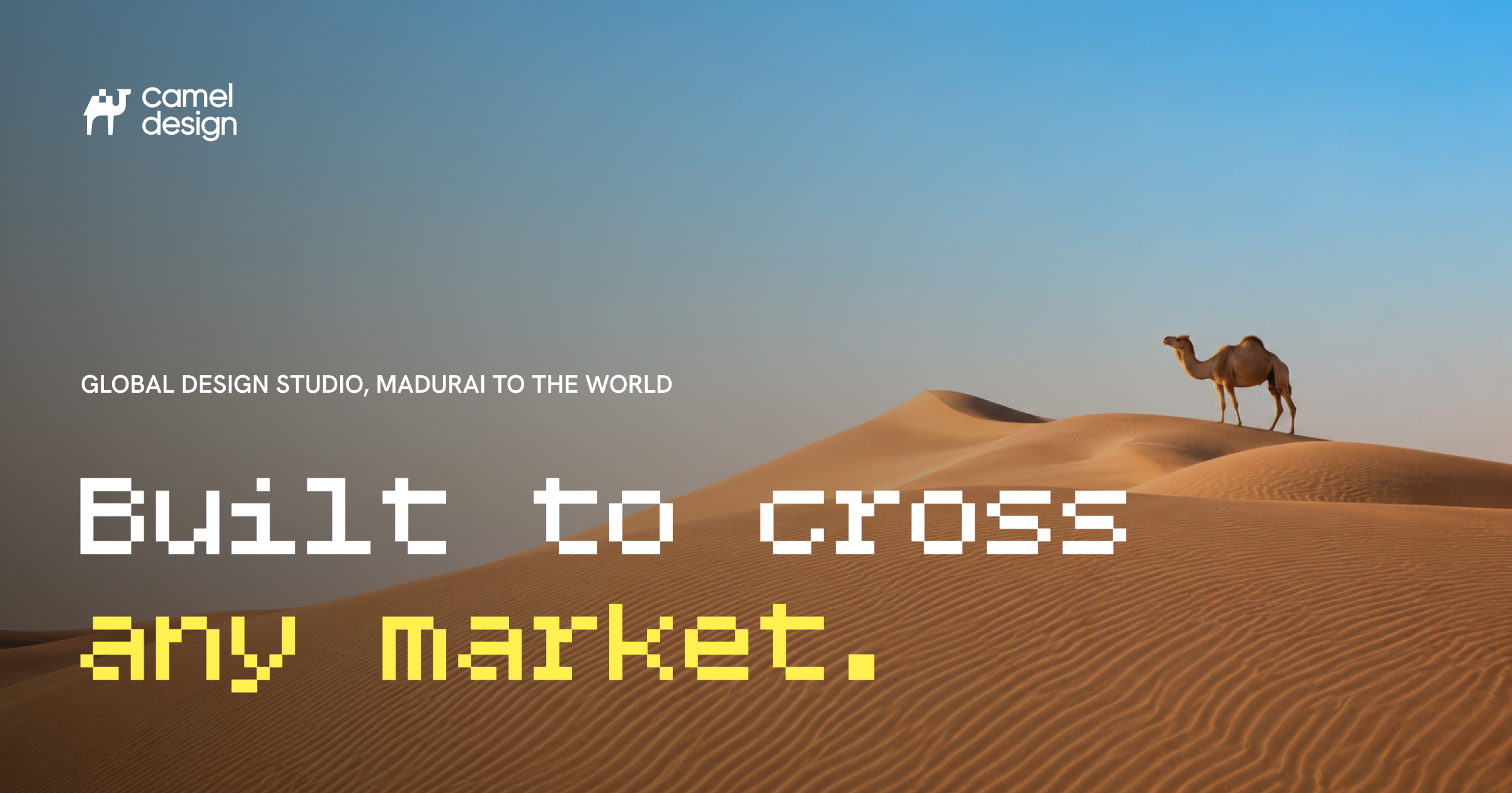
Link preview image
1200 x 630 share image used by the website.
DownloadSlide layouts
Ten layouts to rebuild in Keynote, PowerPoint or Google Slides.
Go to Presentations
12
Social media
Same system, smaller canvas. Big type, one message, real work. The mark stands in for the full logo on small posts.
Camel Design
Built to cross any market.
1 / 6
What a good v1 leaves out.
Swipe →
New case study
Xchangepe: a brand built to earn trust.
Free website audit.
camel.design/audit
Sizes