A course website that sells the career, not just the course.

- Client
- StarAgile
- Industry
- Edtech, professional certification
- Country
- India
- Services
- UX research, UI design, Design system
- Timeline
- 3 months, 2024
(Snapshot)
- 12weeks from research to final design
- 4phases: research, UX, UI, and development support
- 3screen sizes in one responsive type system
- On timeevery deliverable, in the client’s own words
The challenge.
StarAgile trains working professionals for certifications in Agile, Scrum, project management, DevOps, and more. But its website wasn’t helping it grow. The user experience was weak, it wasn’t bringing in enough visitors, and the look no longer matched the quality of its training.
StarAgile asked us for a fresh start: a completely new look and a much better experience for learners.
- Weak user experience. Finding and choosing the right course took too much effort.
- Low traffic. The website wasn’t attracting enough visitors.
- Dated look. The design didn’t reflect a modern training brand.
What we did.
We worked in four clear phases over 12 weeks. Research with stakeholders and the market came first, then information architecture, user journeys, and wireframes. After that came the visual design and design system, and finally close support for StarAgile’s developers during the build. Here are the key decisions.
-
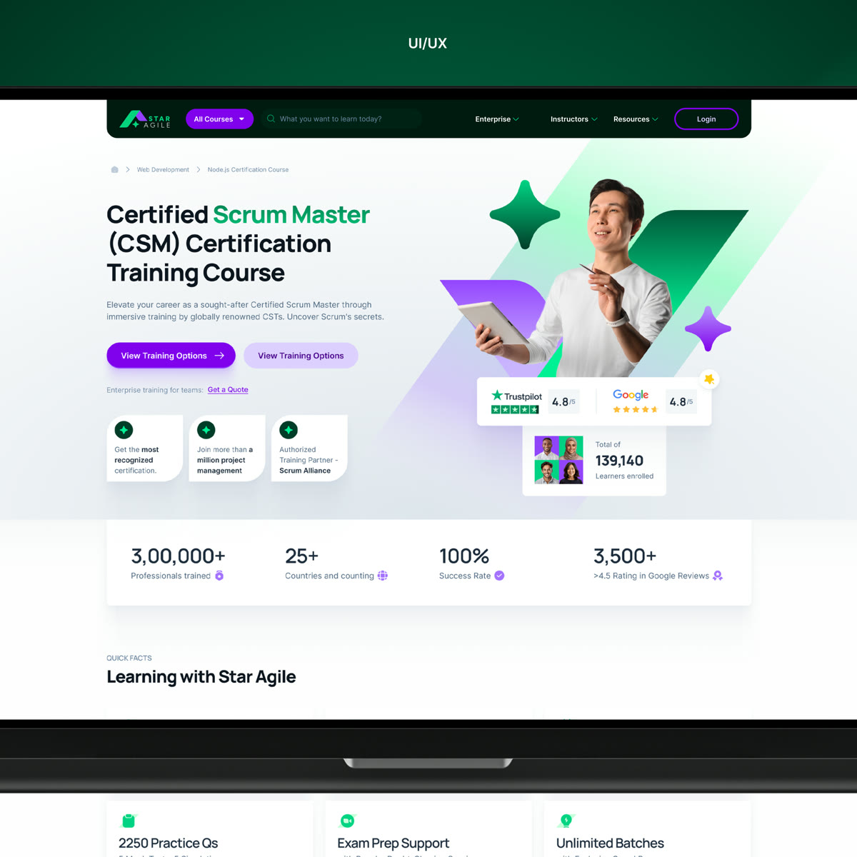
01A course page built to convert
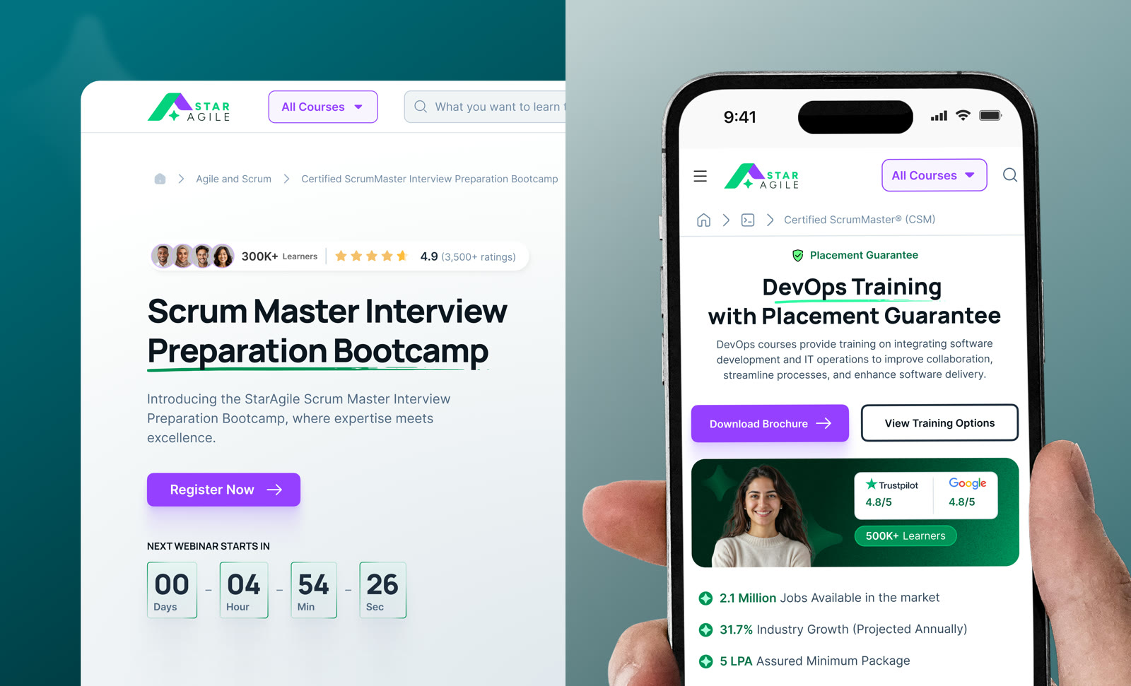
The course page is where people decide, so we designed it to answer every doubt. Trust signals come first: ratings, a money-back guarantee, and real learners. Two clear actions follow, Download Brochure and View Training Options, plus “Get a Quote” for teams. A sticky side menu (Highlights, Curriculum, Tuition, FAQ) keeps Enroll Now always in view.
-
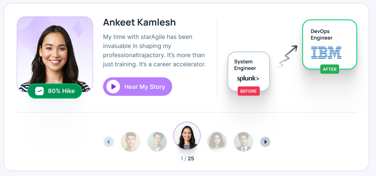
02Selling the career, not just the course
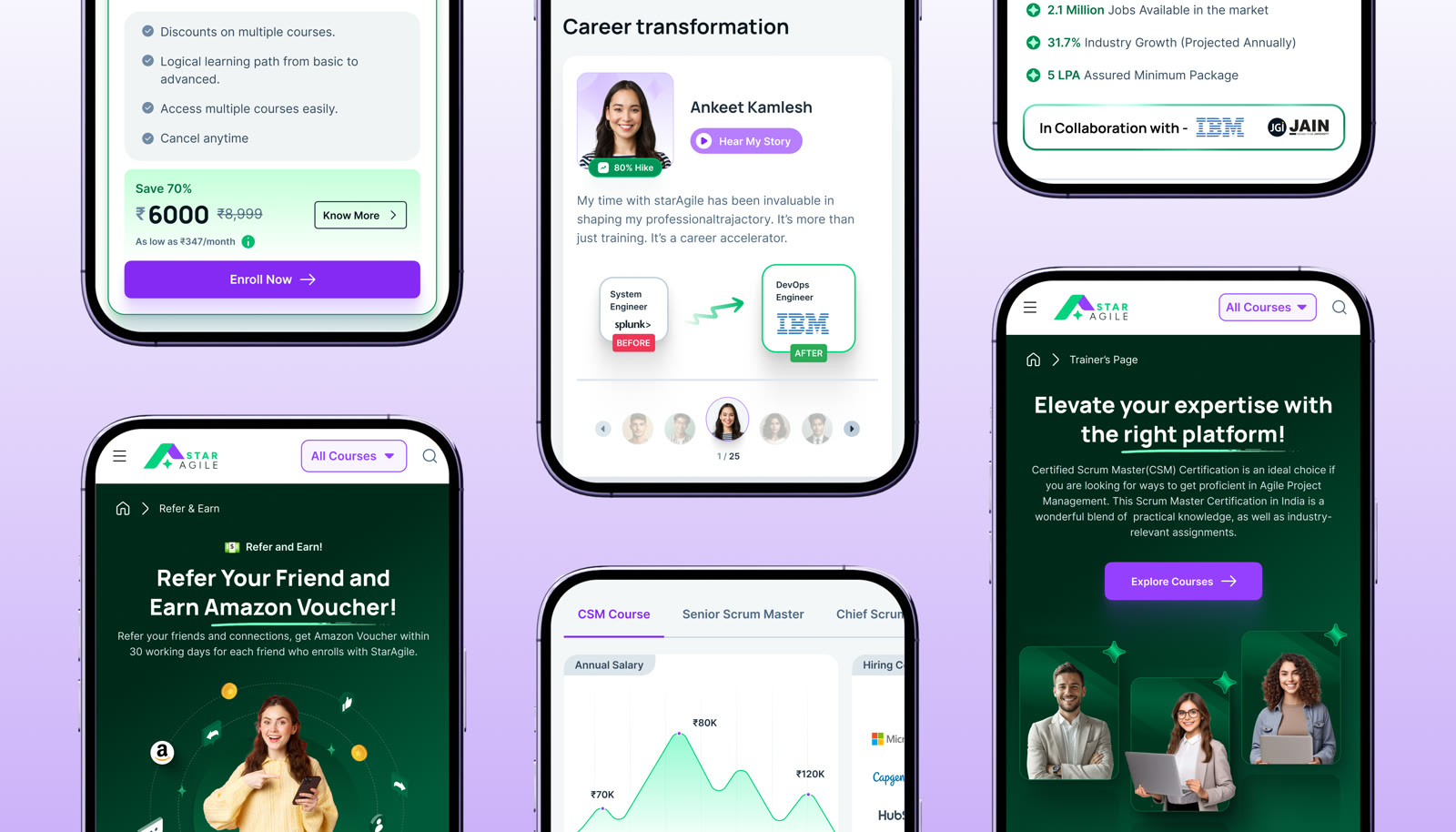
Learners don’t buy a certificate, they buy a better career. So each course page shows real career proof: before and after stories of learners who moved to new roles, salary charts by job level, the companies that hire, and job market data.
-
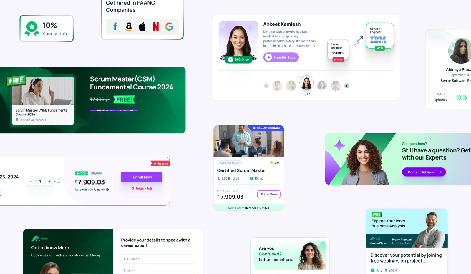
03Clear pricing and batches
Choosing a batch used to take effort. Now each batch card shows the date, price, discount, monthly payment option, seats, and labels like “Nearly full”, so learners can compare and enrol in one step.
-
04Many ways in
Not every visitor is ready to buy on day one. We designed several low-pressure next steps: free courses, live webinars with a countdown, masterclasses, “talk to an advisor” forms, coupons, and a Refer and Earn programme. Every visitor has something to do next.
-
05Mobile first
Most learners browse on their phones. “All Courses” and search sit at the top of every screen, so any course is one tap away, and every page was designed for mobile, not just shrunk down.
-
06A design system that scales
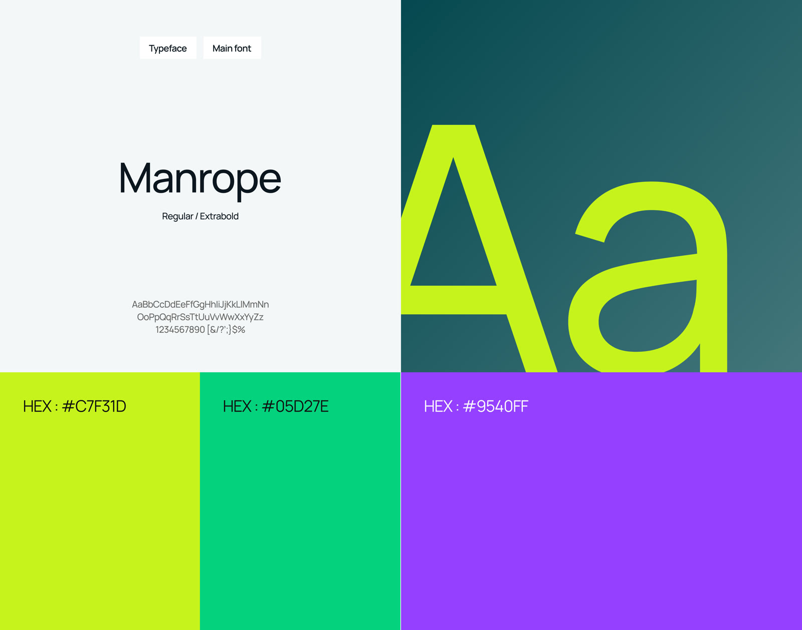
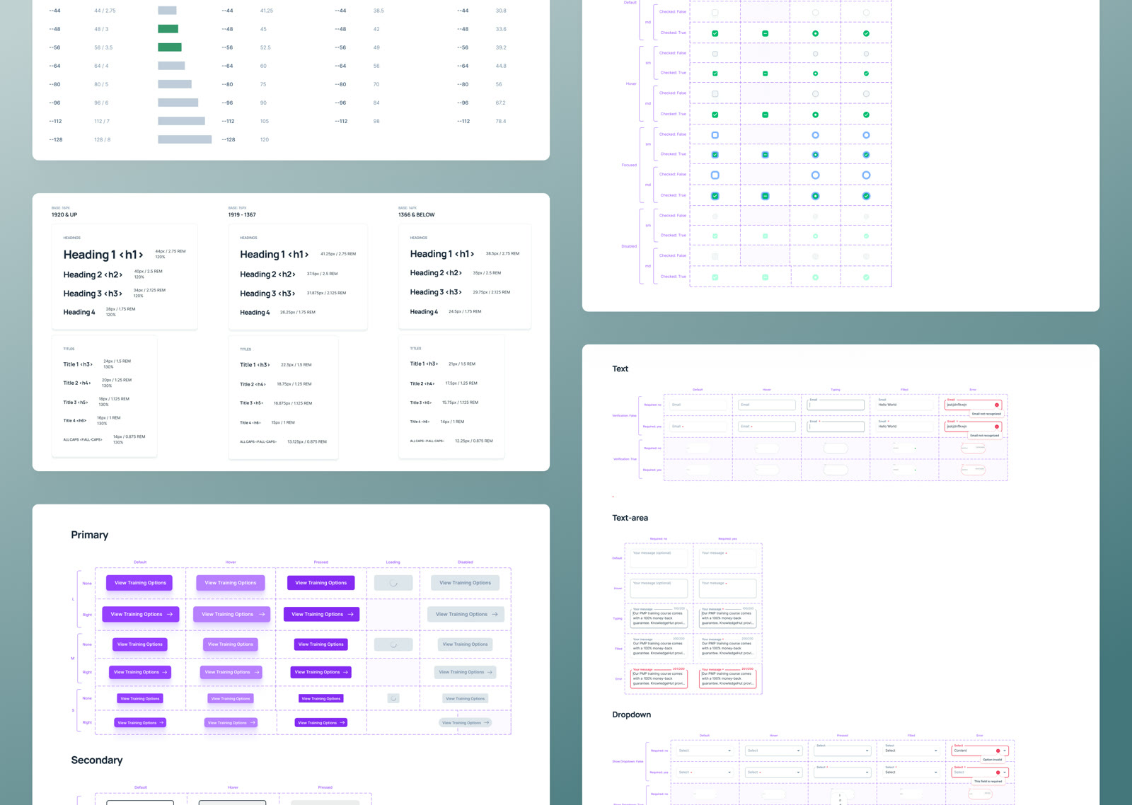
StarAgile runs many courses, so consistency mattered. We created a design system with the Manrope typeface, a fresh lime, green, and purple palette, type sizes for three screen widths, and every component designed in all its states, from default to hover, loading, disabled, and error. New course pages can be made quickly without breaking the look.
The result.
- 12weeks, delivered on time
- 6key UX decisions across course, career, pricing, and mobile
StarAgile now has a modern website that helps learners find the right course, see what it can do for their career, and enrol with confidence. The new design is live on staragile.com.
“Camel Design did a phenomenal job, exceeding our expectations in every way. Not only were all deliverables completed on time but the designs were of top-notch quality, showcasing their expertise and attention to detail.”

What we delivered.
- Stakeholder and market research
- Information architecture and user journeys
- Wireframes
- Website UI design, desktop and mobile
- Course page template with career proof, pricing, and batch picker
- Webinar, free course, and masterclass pages
- Refer and Earn and coupon designs
- Lead capture forms
- Design system with responsive type and full component states
- Development support during the build
More case studies.
(Start a project)
Want results like this?
Tell us what you’re building. We reply within 24 hours.