How Techademy opened its doors to individual learners.
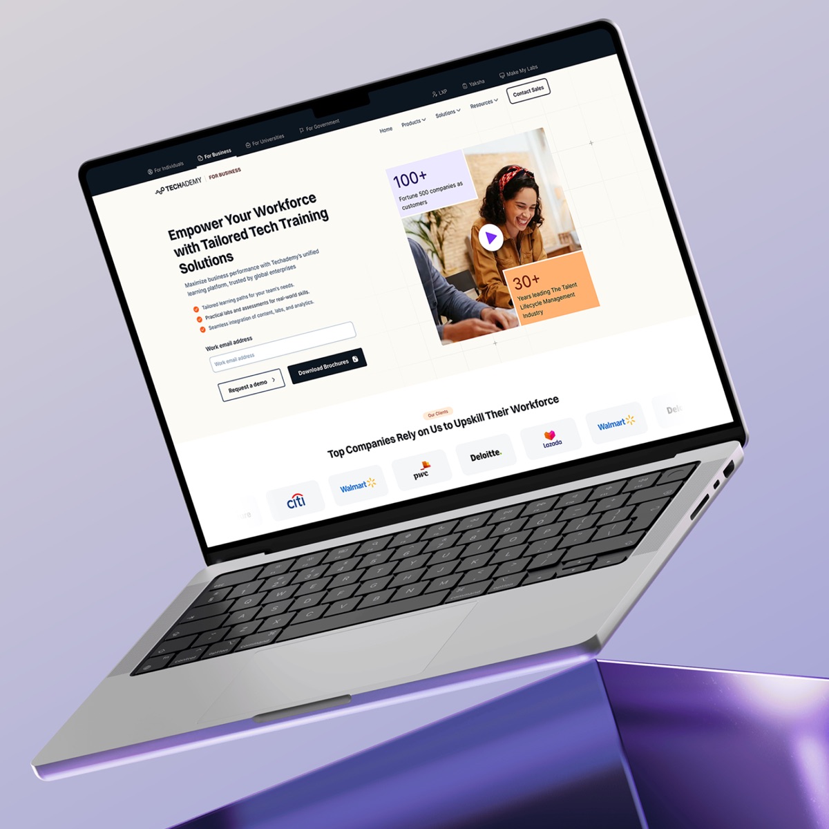
- Client
- Techademy
- Industry
- Edtech
- Country
- India
- Services
- UX, UI, Design system
- Timeline
- 6 months, 2024 to 2025
Live from 2025. Techademy has since redesigned its website.
(Snapshot)
- 40pages designed
- 2journeys, business and individual
- 4audiences on one website
- 6months from research to final design
The challenge.
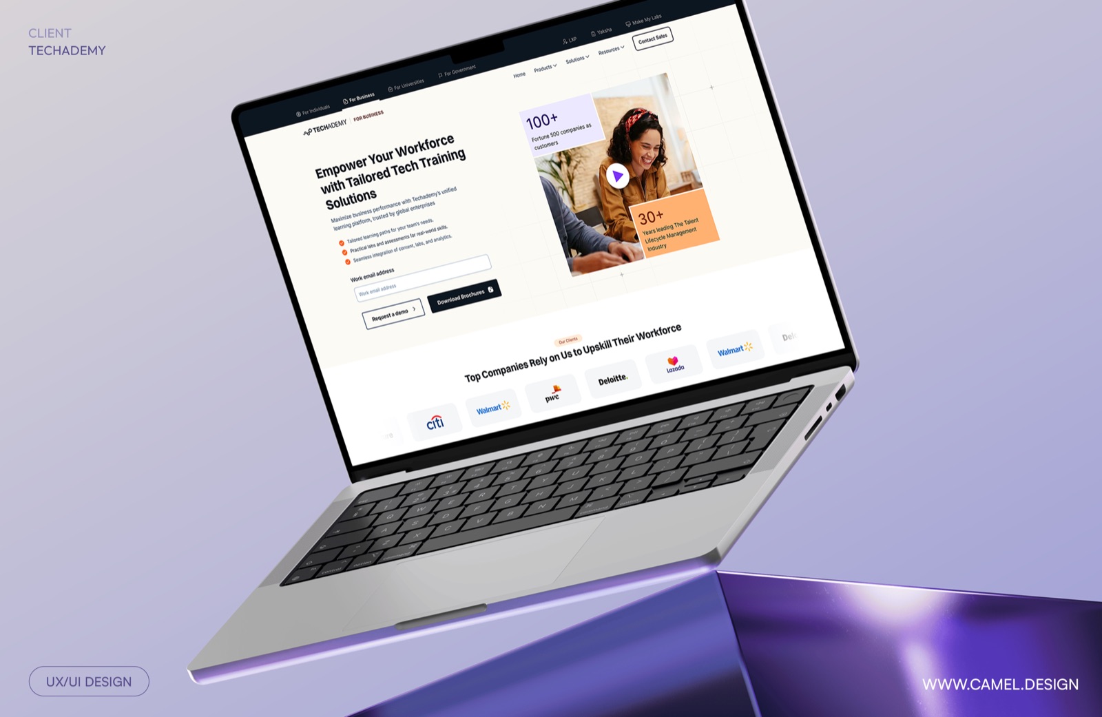
Techademy had built a strong business training employees for large companies, mostly through in-person classroom programs. But online, it was hard to see that strength. The website didn’t reflect the quality of its training.
Techademy also wanted to grow in a new direction: selling courses directly to individual learners. That meant building a B2C journey from the ground up, while keeping the website just as strong for its enterprise clients.
- Weak online presence. The website didn’t match the strength of the business.
- No B2C journey. There was no clear path for individual learners to find and buy a course.
- Two very different audiences. Enterprise buyers and individual learners needed different journeys on one website.
What we did.
We designed the full website, from research and user flows to the final design system, across 40 pages. Our scope was the website only, not the learning platform. Here are the key decisions.
-
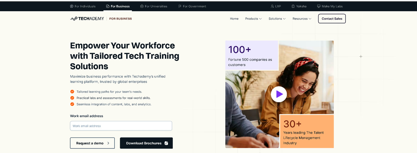
01One website, four front doors
Techademy serves companies, individuals, universities, and government. Instead of mixing them together, we added a simple switch at the top of every page, so each visitor goes straight to their own journey. A team leader sees demos and enterprise pricing. A solo learner sees courses and enrolment.
-
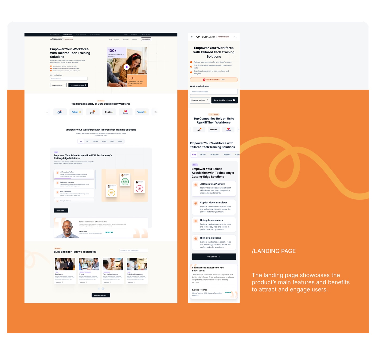
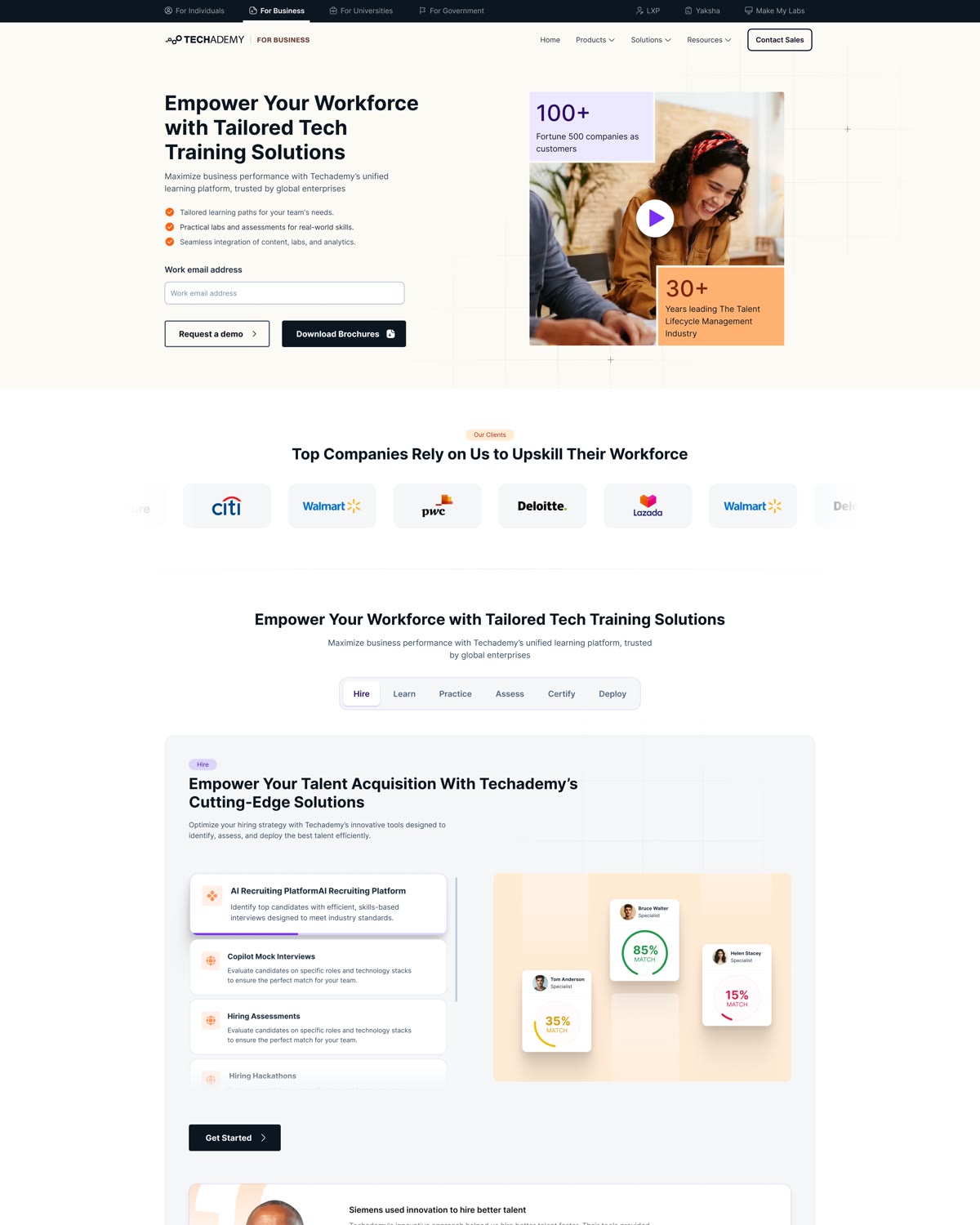
02Showing enterprises the full picture
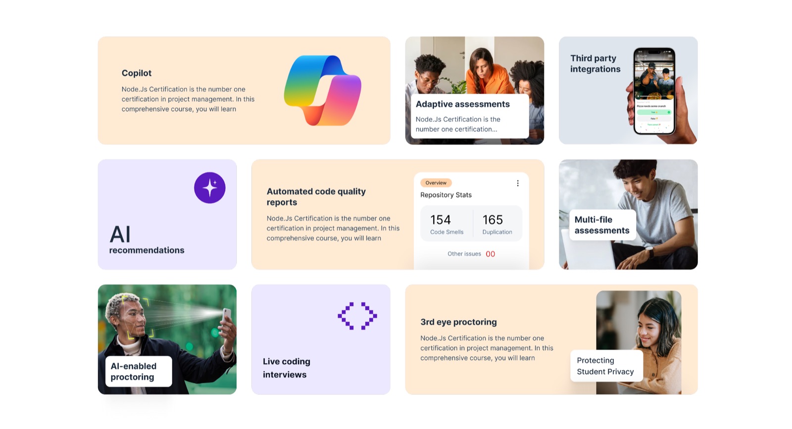
Techademy does much more than training. It helps companies hire, train, test, certify, and deploy their people. We turned this into six simple tabs, so a buyer can see the whole talent lifecycle in one scroll, with a demo request always one click away.
-
03A B2C journey built from scratch
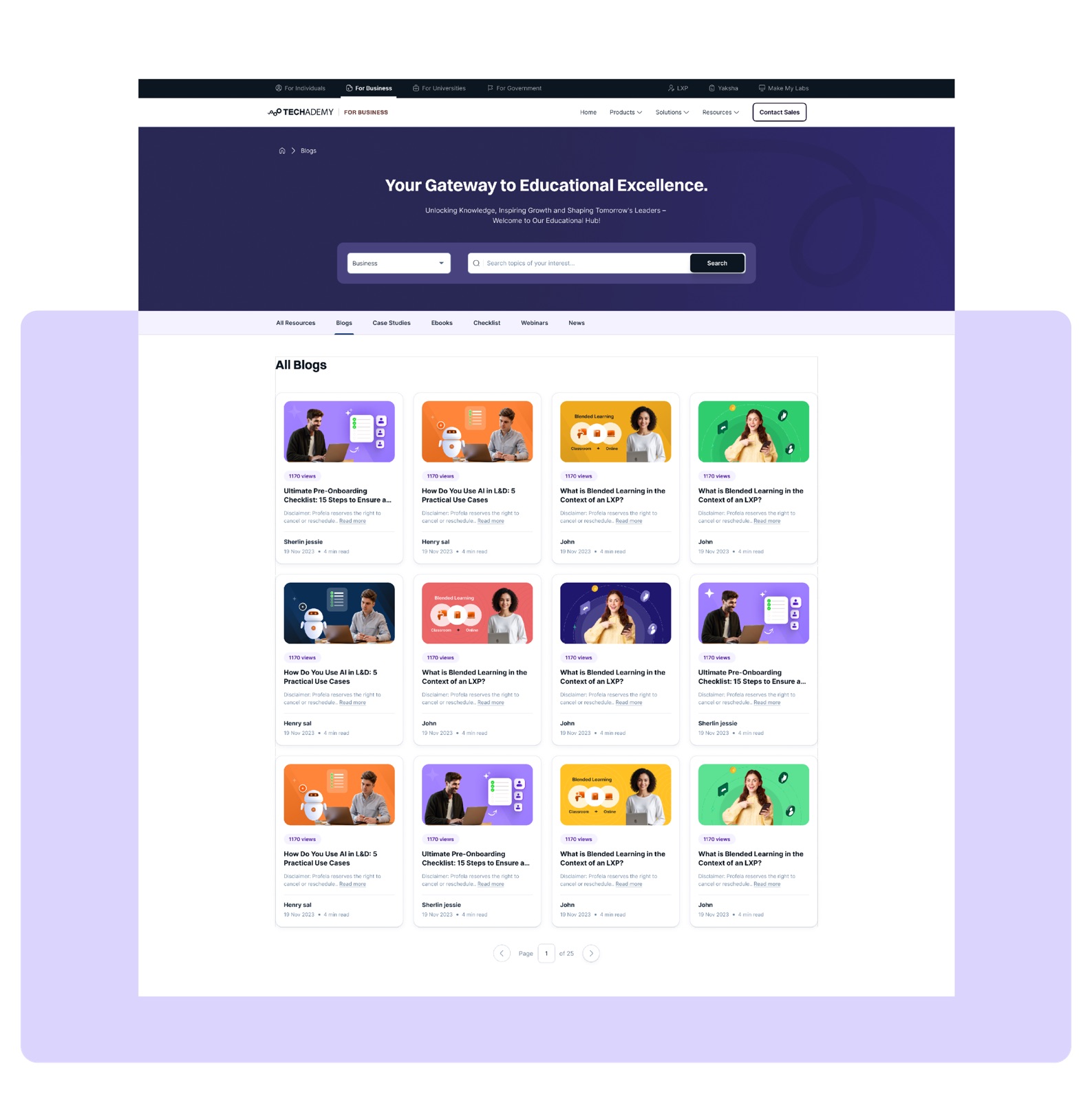
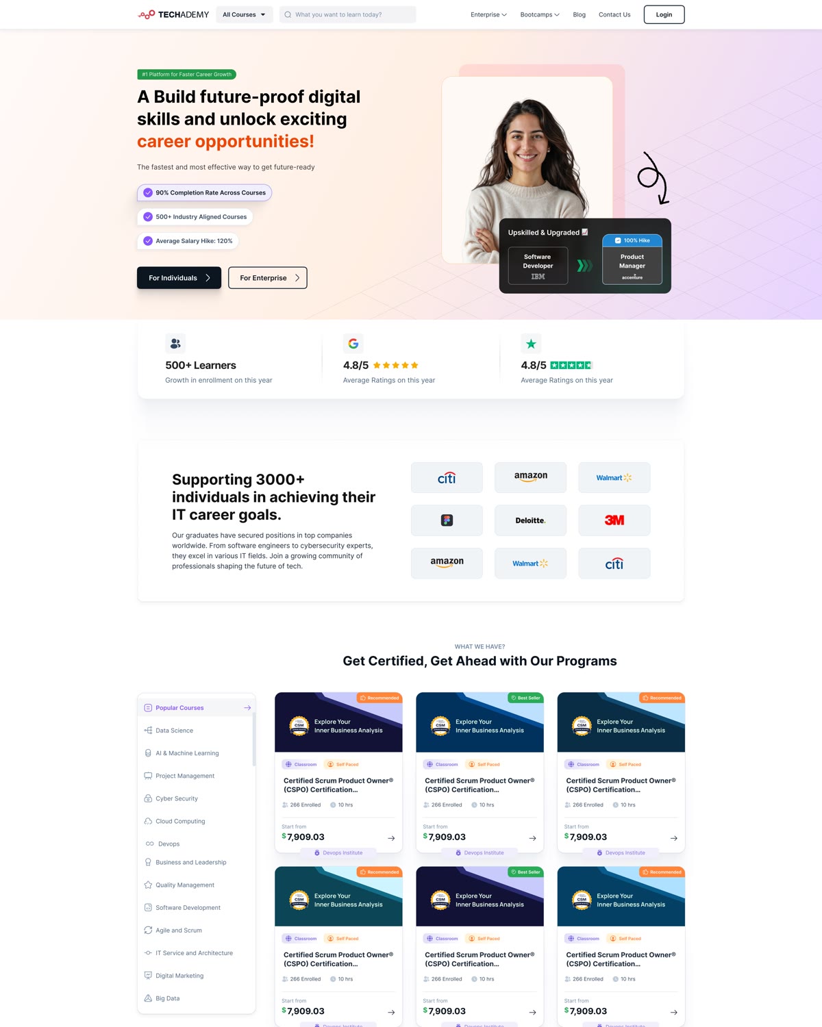
Individual learners had no clear path on the old site, so we designed one from the ground up. Learners can search or browse by category, compare courses at a glance (price, duration, mode), and land on a course page built to answer one question: is this worth it for my career?
-
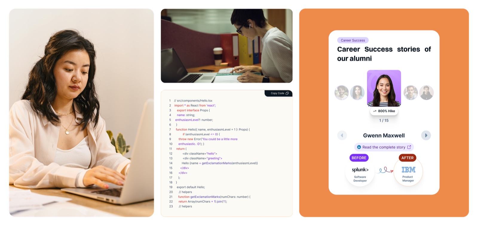
04A course page that sells the career, not just the course
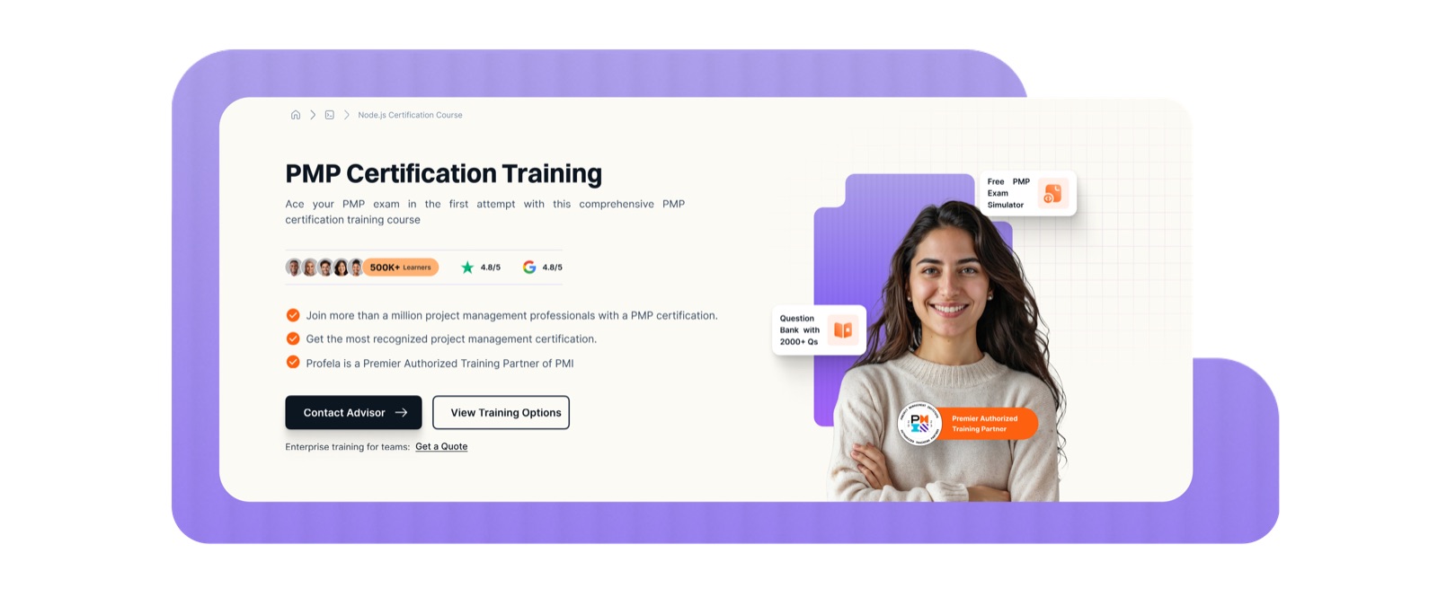
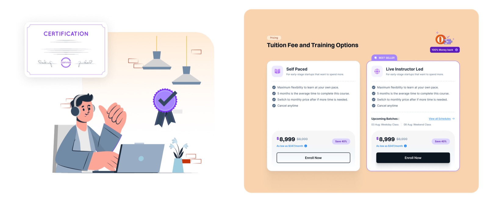
Each course page leads with career proof: salary growth, hiring companies, and real alumni stories. A visual roadmap shows every step to certification.
Then learners compare Live vs Self Paced pricing, pick a batch that fits their week, and enrol. Group discounts and a “train your team” section quietly pass enterprise buyers to the B2B side.
-
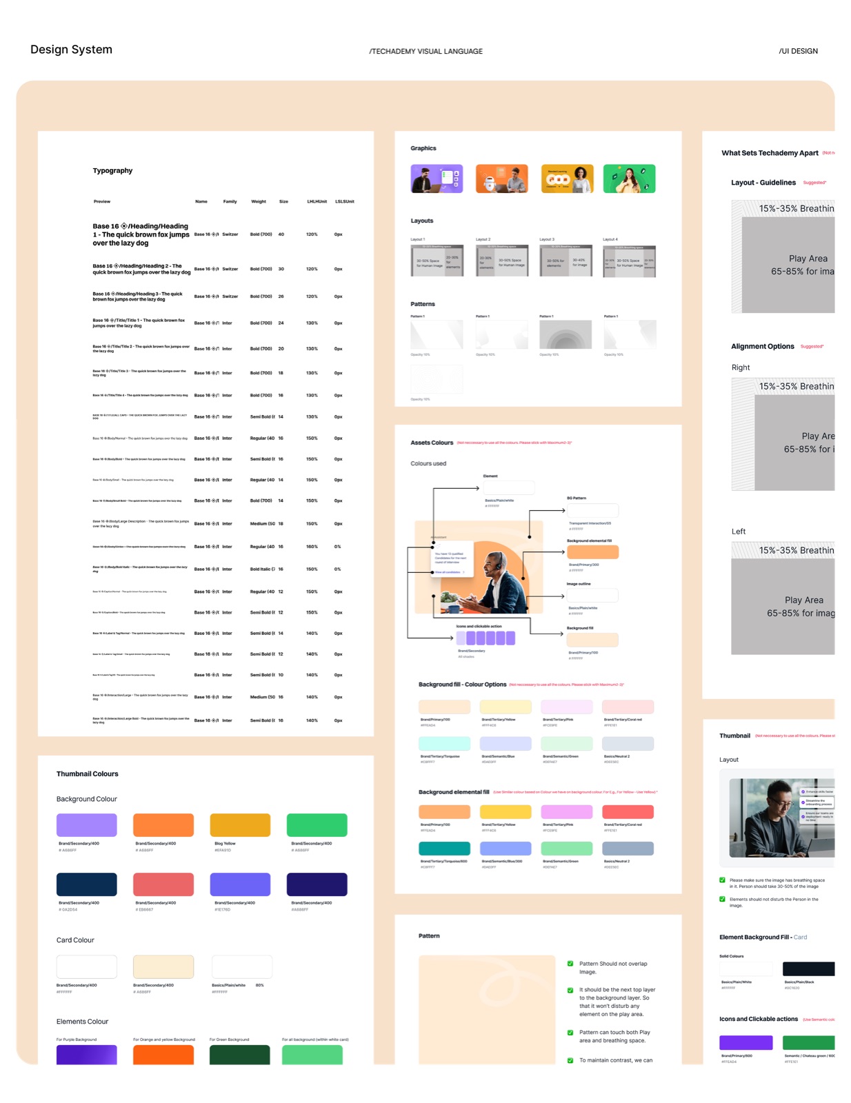
05One design system for both journeys
B2B and B2C pages look different but are built from the same set of components: course cards, FAQ blocks, expert profiles, review sections, and “talk to an advisor” banners. This kept 40 pages consistent and made it easy for Techademy’s team to add new courses.
The result.
- 40pages designed across two journeys
- 2journeys on one website: business and individual
Techademy went from a B2B only website to one that serves two very different audiences. Enterprise buyers get a clear path to a demo, and individual learners get a complete journey from browsing a course to choosing a batch and enrolling. The design went live in 2025.
What we delivered.
- UX research and user flows
- Website UI design, desktop and mobile
- Design system
- 40 pages across B2B and B2C
- Audience switcher for 4 audiences
- B2B homepage and enterprise course pages
- B2C homepage with course discovery
- B2C course pages with pricing, batch picker, and career roadmap
- Developer ready Figma files
More case studies.
(Start a project)
Want results like this?
Tell us what you’re building. We reply within 24 hours.