A brand identity as premium as the cakes.

- Client
- Sugar Play
- Industry
- Premium cakes and desserts
- Country
- India
- Services
- Brand identity, Brand guidelines, Packaging
- Timeline
- 1 month, 2026
Creative direction and design: Preethika Asokan
(Snapshot)
- 6dessert-inspired brand colours
- 3logo lockups: primary, secondary, tertiary
- 3typefaces in one clear hierarchy
- 1month from brief to brand guidelines
The challenge.
Sugar Play is not an ordinary cake shop. Founder Ashra Arafath makes premium, handcrafted buttercream cakes in Madurai, for weddings, celebrations, and special moments. The business already had loyal customers who valued her quality and were happy to pay for it.
But the old brand identity didn’t match the cakes. It looked ordinary next to the work it stood for, and it caused problems in print, so it never looked consistent across boxes, labels, and menus. Ashra asked us to redesign it completely and build a brand that feels as premium as her cakes.
- Brand behind the product. The identity didn’t reflect the quality and price of the cakes.
- Print problems. The old logo didn’t print well, so it looked different on every item.
- No system. There were no clear rules for colours, fonts, or how the brand should be used.
What we did.
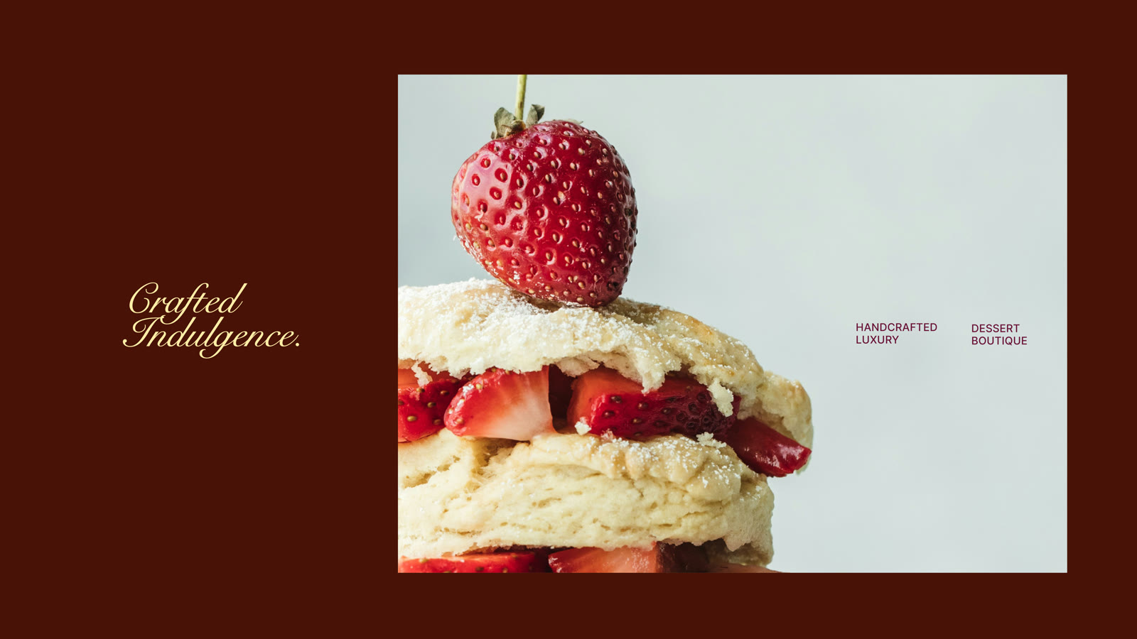
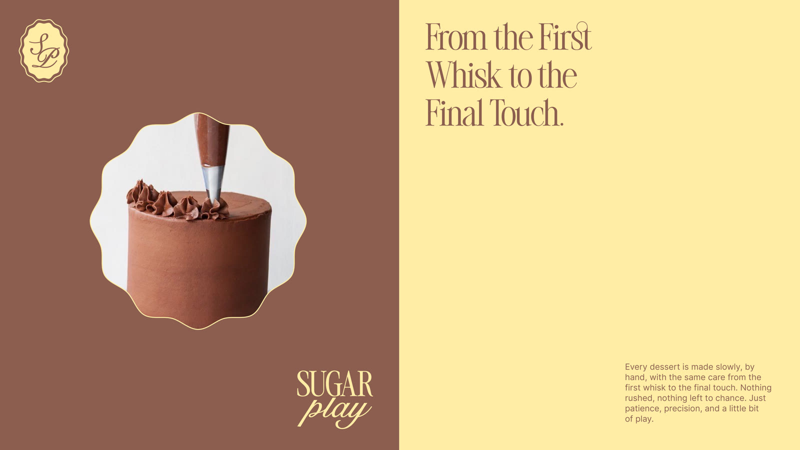
Ashra’s cakes are made by hand, slowly, with a little bit of play. We built the brand the same way: a classic, elegant base with dessert-inspired details. Here are the key decisions.
-
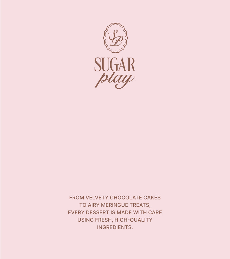
01Classic meets play, right in the name
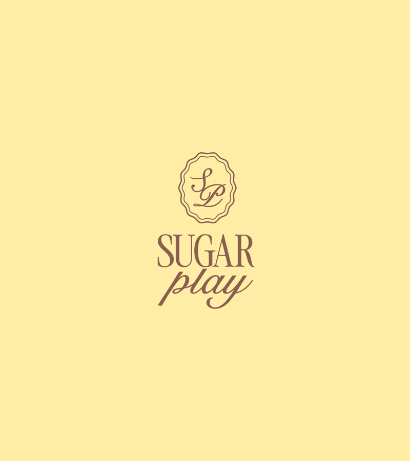
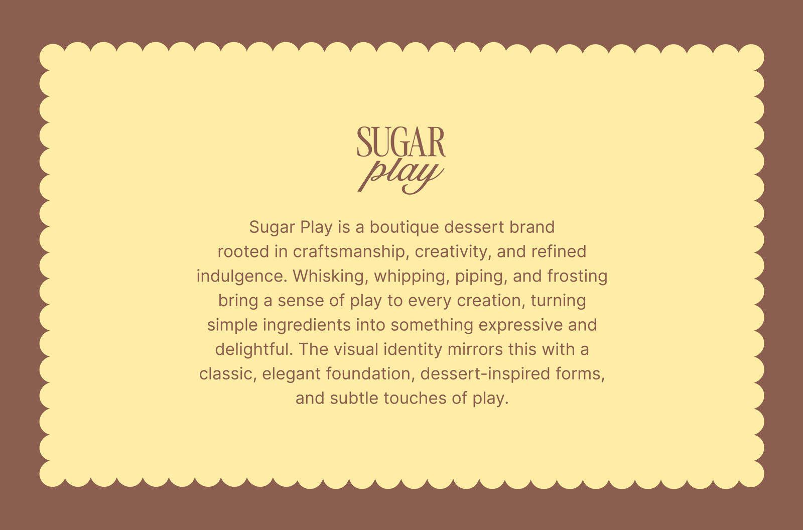
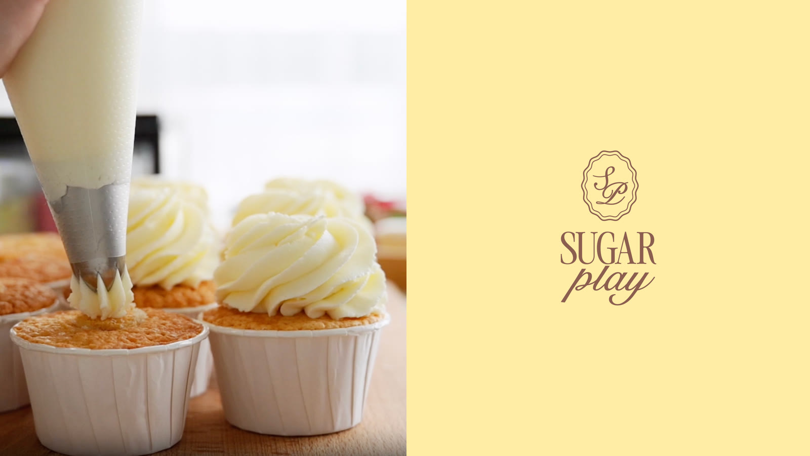
We set “SUGAR” in a tall, elegant serif and “play” in a flowing script. The name itself shows the balance of the brand: refined and premium, with a light touch of fun.
-
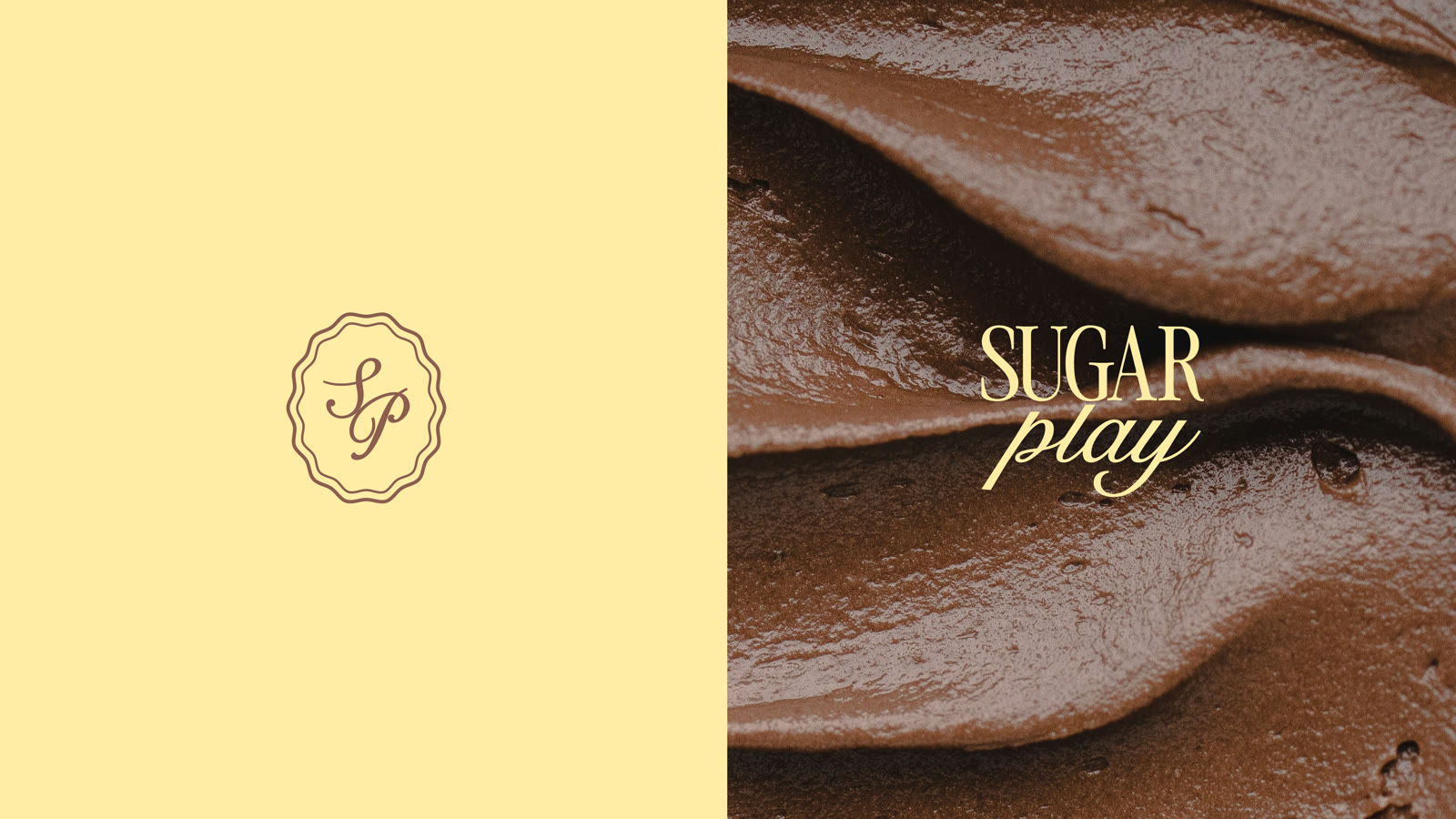
02A monogram that works at any size
The SP monogram sits inside a scalloped frame, like piped icing or the edge of a cake board. It works as a seal on boxes, stickers, and labels, even at very small sizes, so the brand prints clearly every time.
-
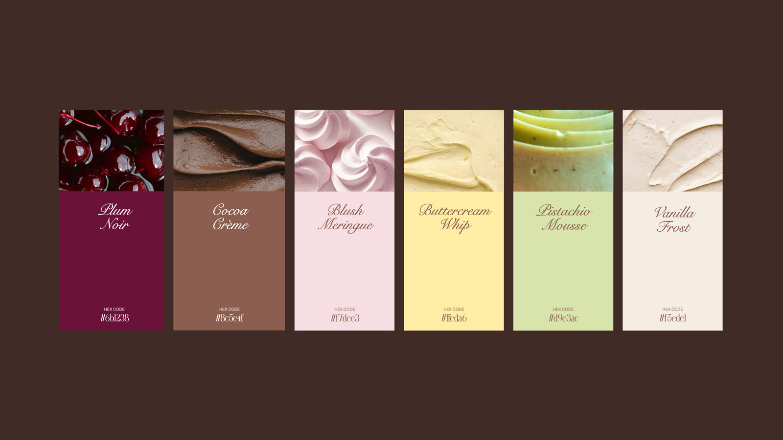
03A palette named after desserts
Six colours, each taken from the kitchen: Plum Noir, Cocoa Crème, Blush Meringue, Buttercream Whip, Pistachio Mousse, and Vanilla Frost. Every colour comes with tested pairings and contrast rules, so they always look good together.
-
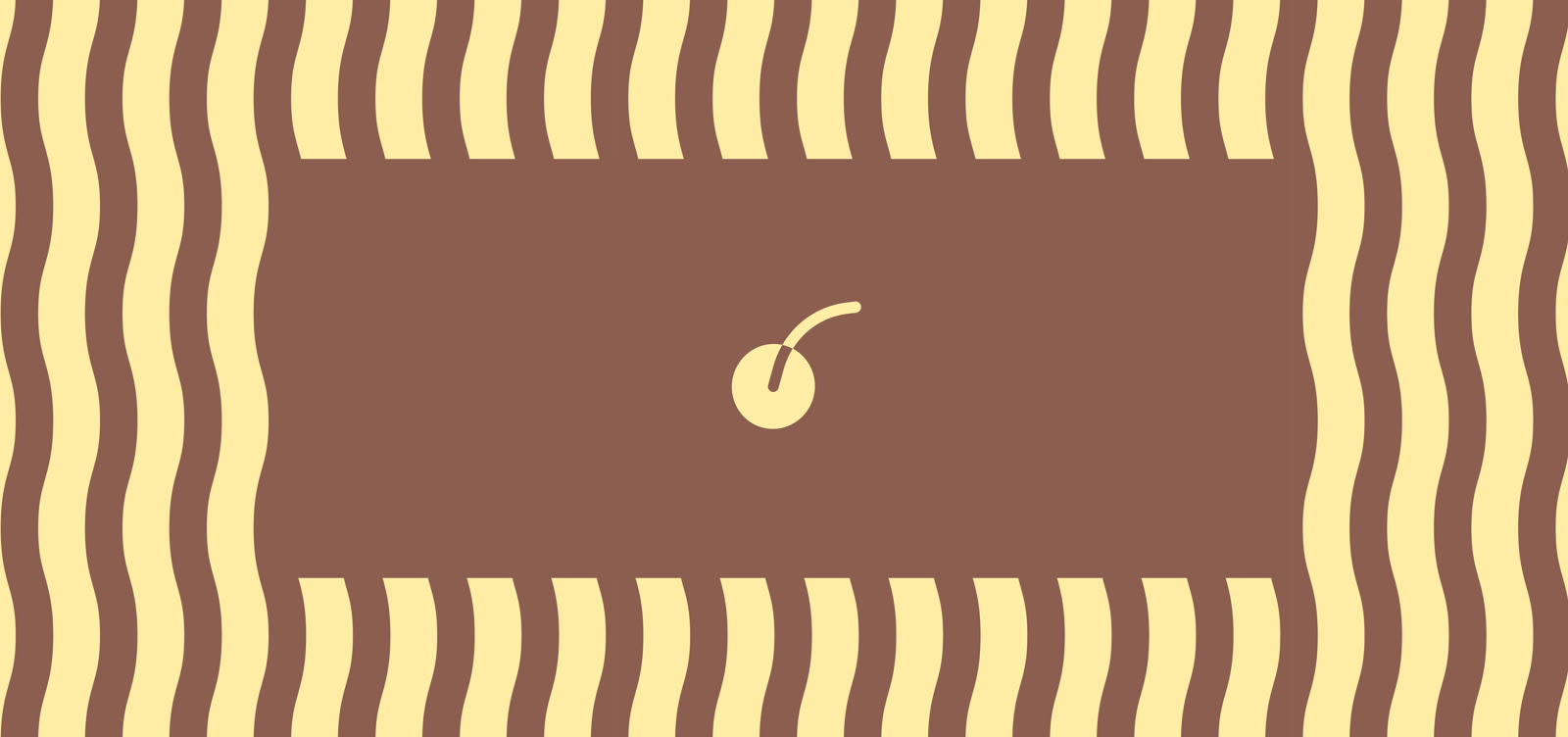
04Shapes taken from the kitchen
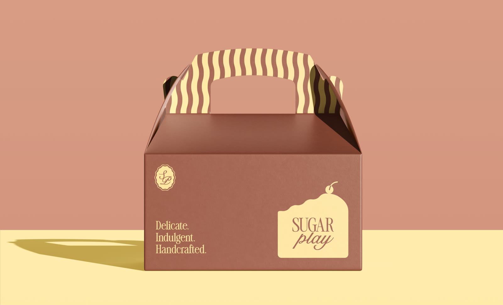
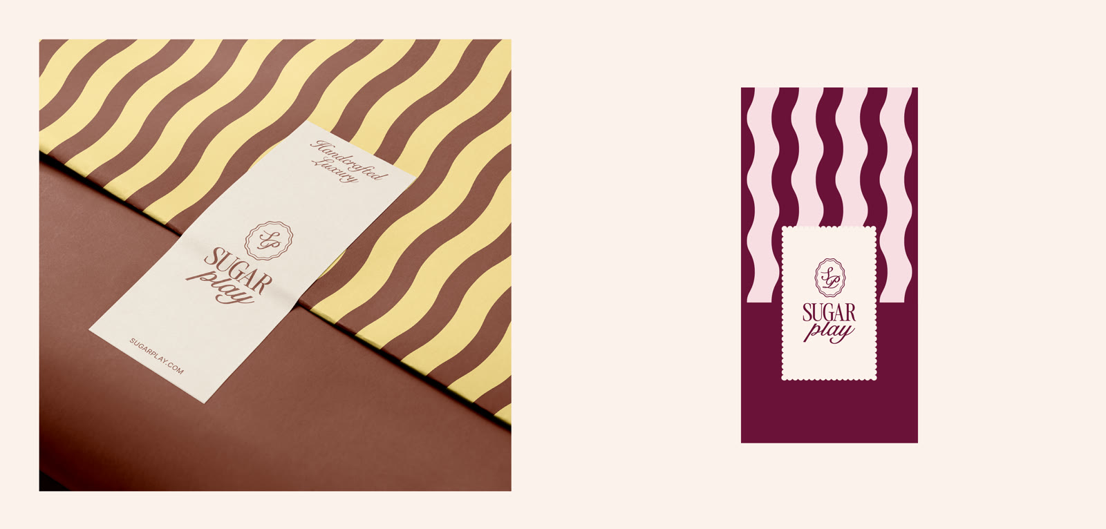
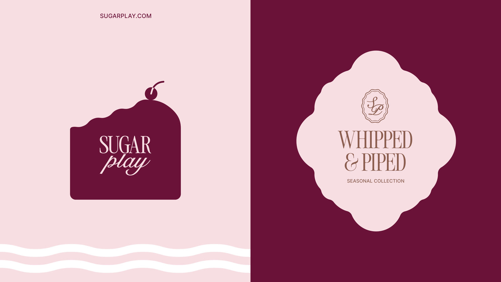
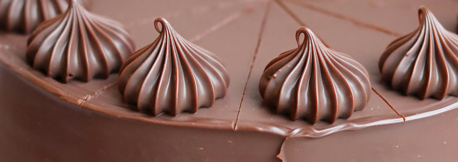
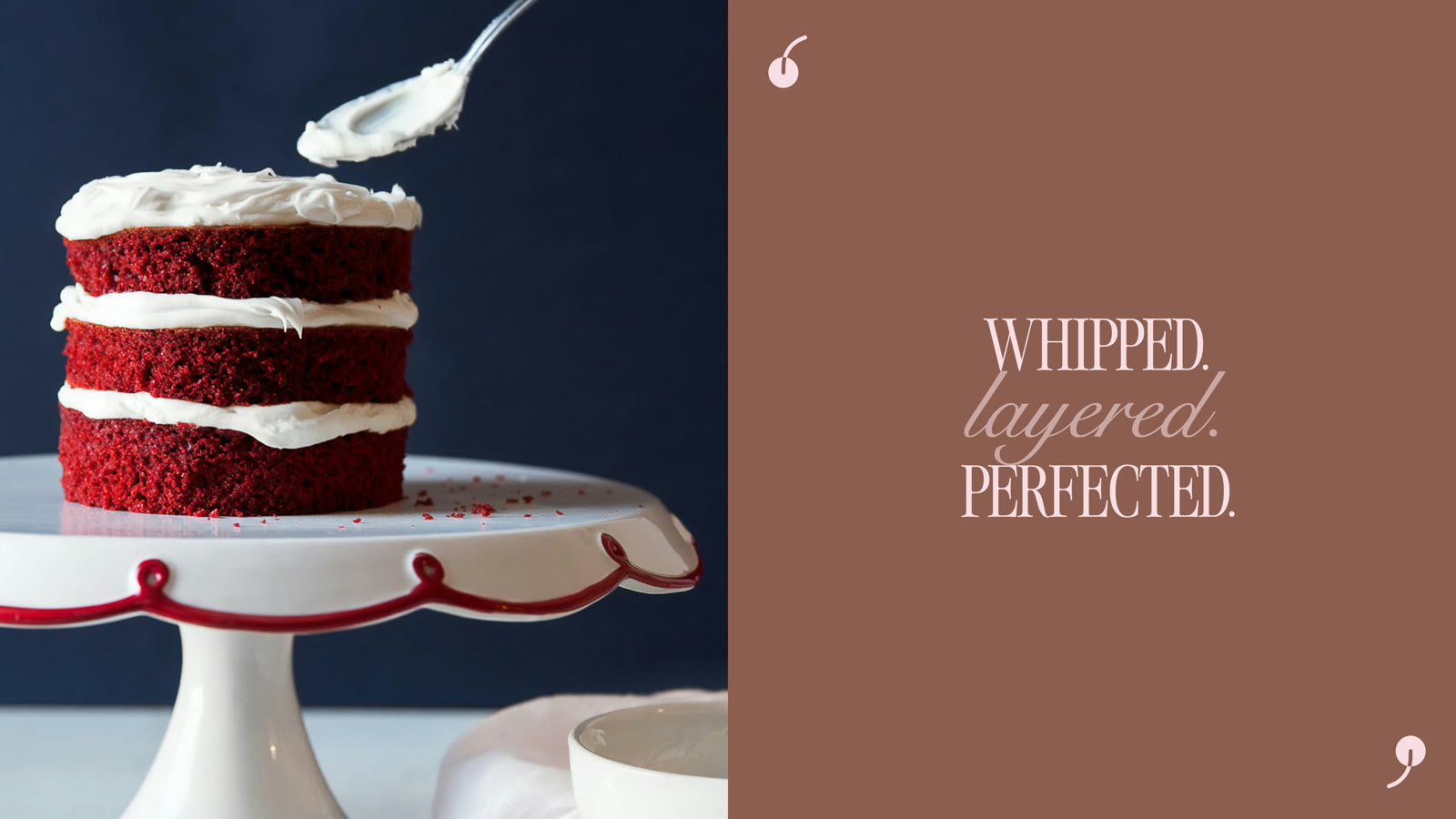
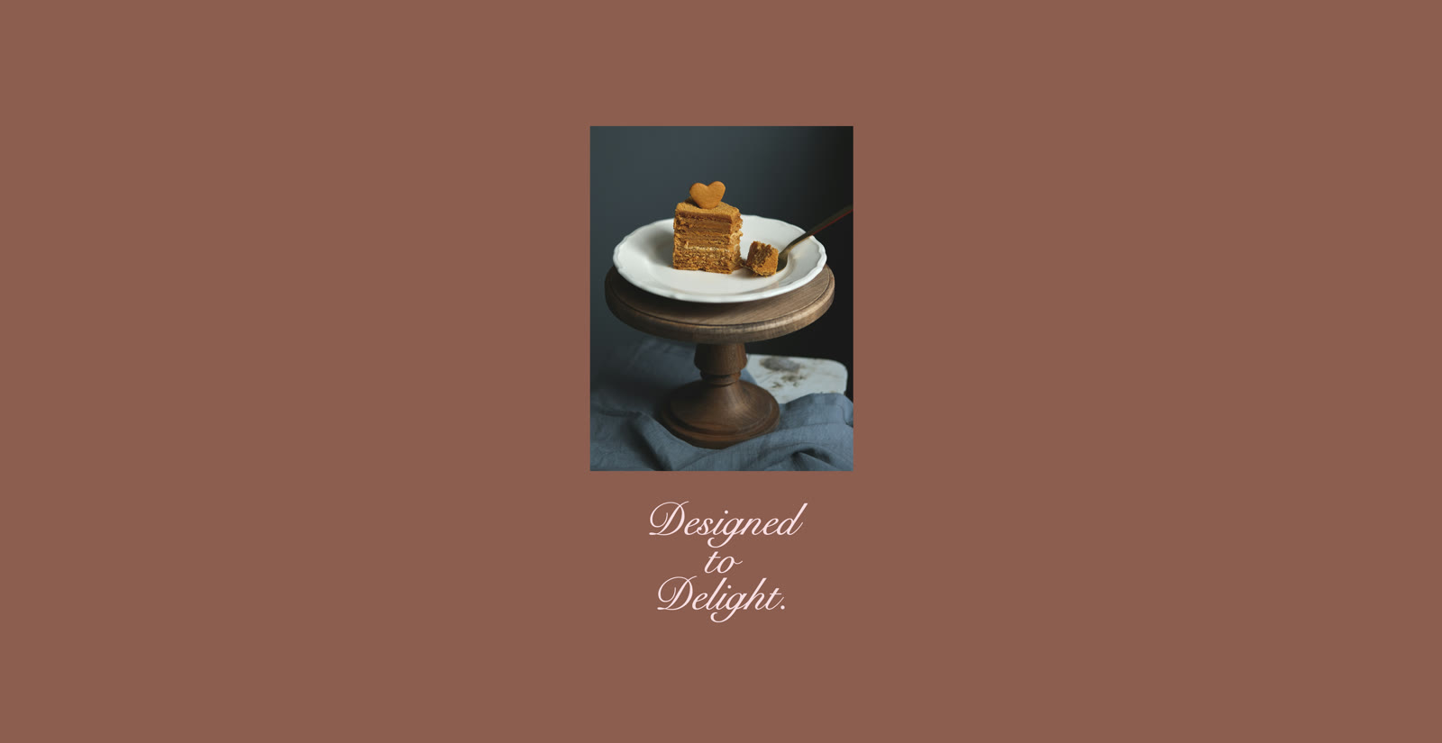
Wavy stripes like piped buttercream, scalloped edges, a cake-slice label topped with a cherry, and even cherry-shaped quotation marks. Small details that make the brand feel handmade and joyful.
-
05Packaging that feels like a gift
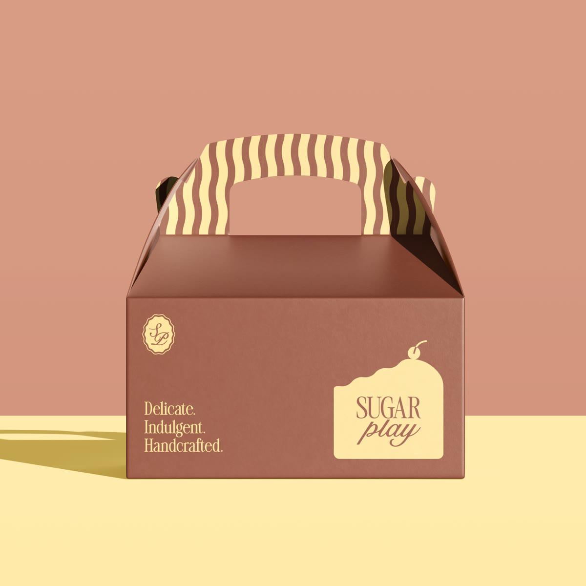
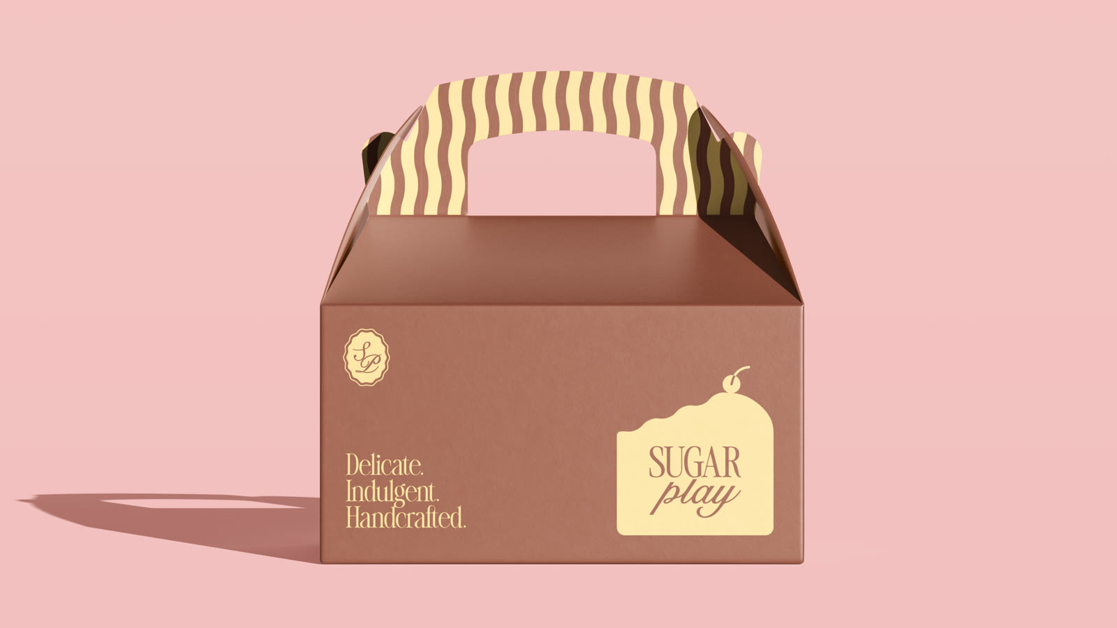
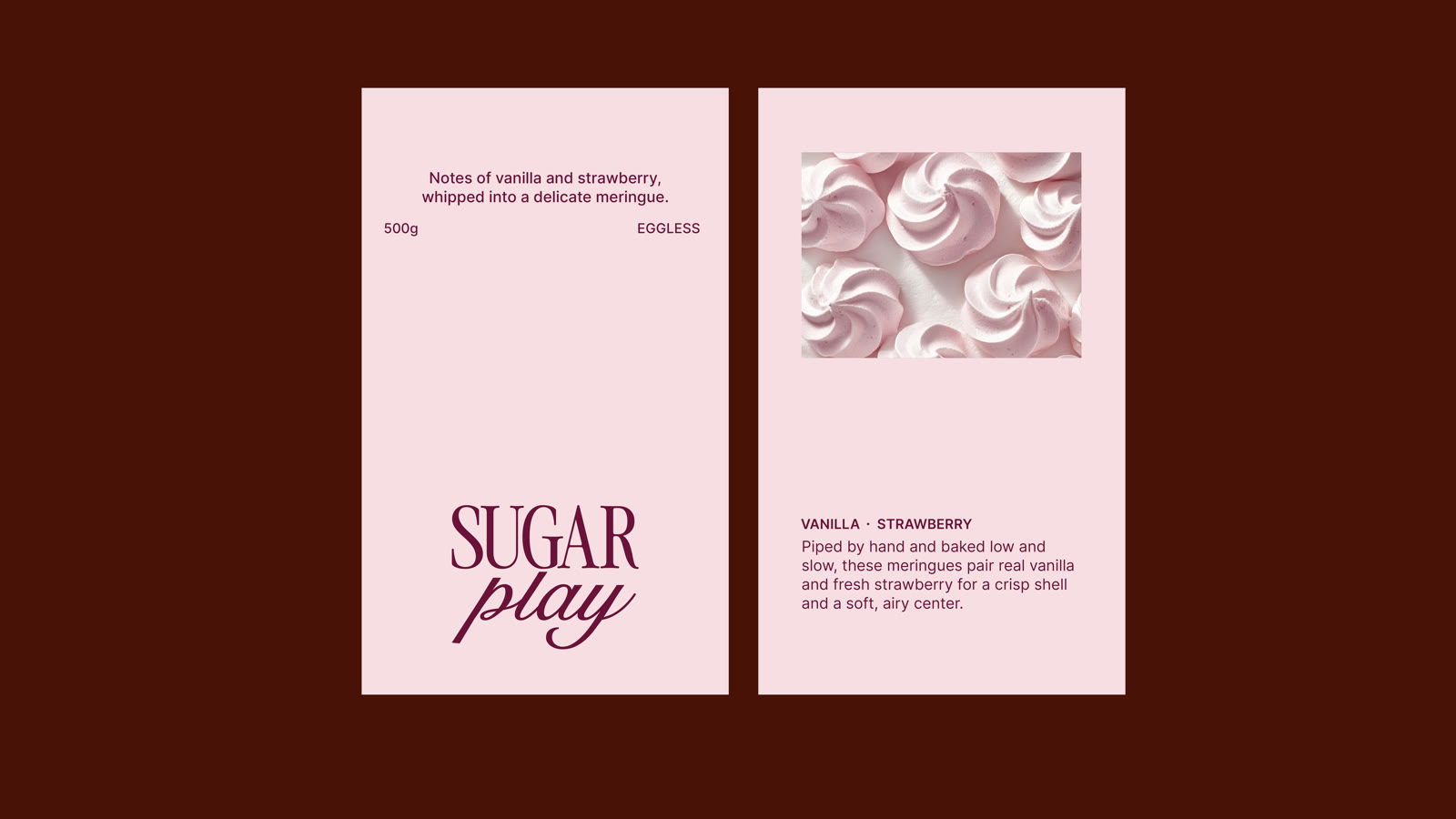
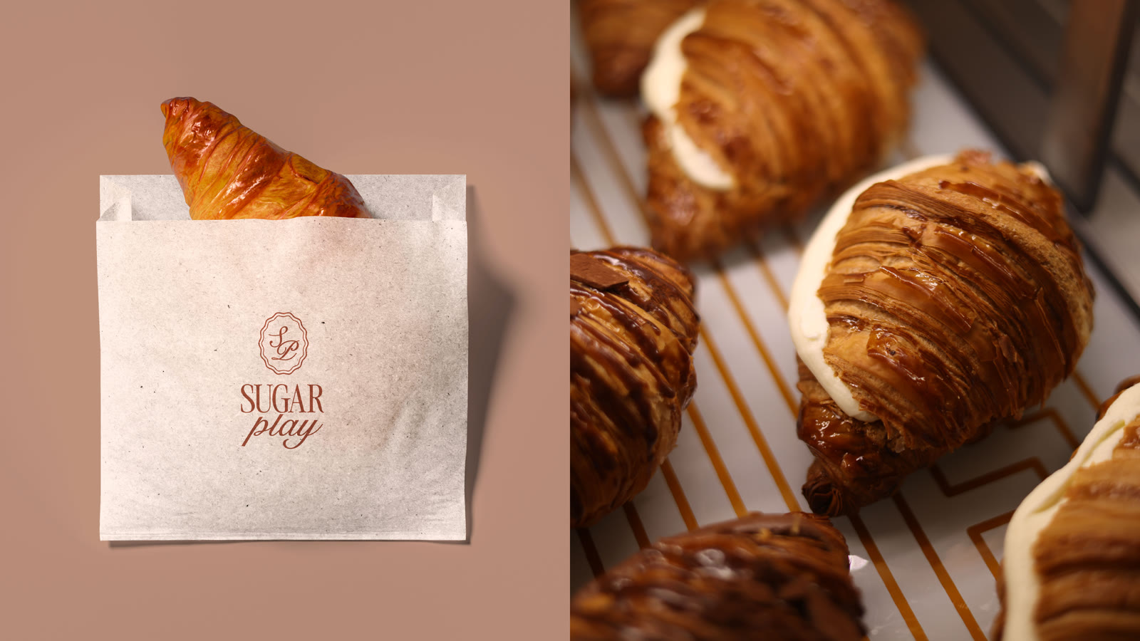
A cake box with a striped handle and the line “Delicate. Indulgent. Handcrafted.” Product labels, pastry bags, and seasonal collection labels like “Whipped and Piped” all carry the same look, so every order feels like a premium gift.
-
06Guidelines so it never goes wrong again
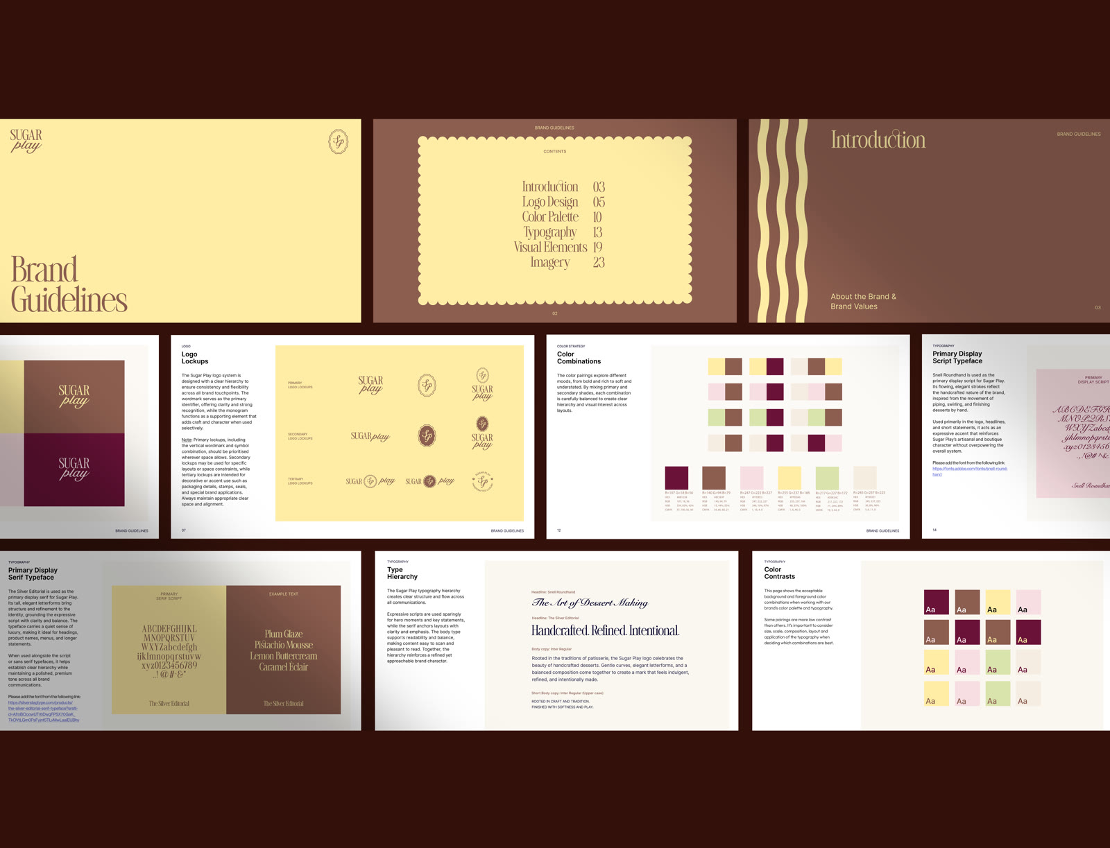
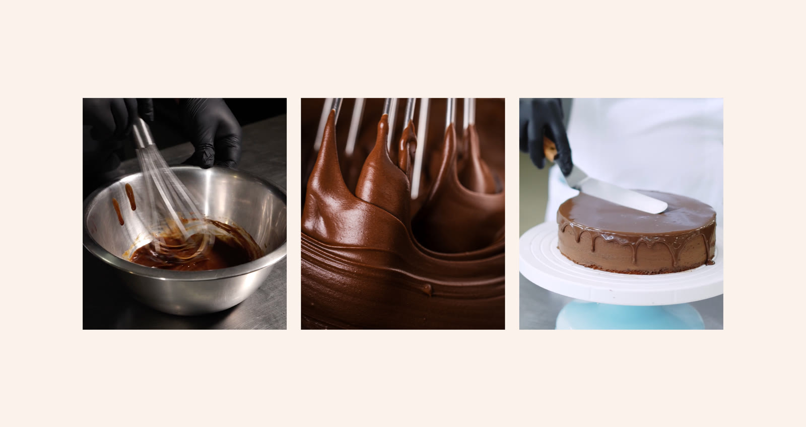
The old identity broke down in print. So we wrote clear brand guidelines: logo lockups, colour combinations, a type hierarchy, and imagery rules. Now every printer and team member can apply the brand the right way, every time.
(The brand in use)
The result.
- 1complete brand system, from logo to packaging
- 1month from brief to final guidelines
Sugar Play now has a brand that matches the quality of its cakes. The new identity is already live on its Instagram, and every box, label, menu, and card now looks consistent and premium.
Ashra’s story, in her own words. Coming soon.
What we delivered.
- Logo and wordmark
- SP monogram
- Logo lockups: primary, secondary, tertiary
- Colour palette with pairings and contrast rules
- Typography system
- Brand patterns and visual elements
- Cake box and packaging design
- Labels and stickers
- Menu card
- Business cards
- Signage
- Brand guidelines document
More case studies.


(Start a project)
Want results like this?
Tell us what you’re building. We reply within 24 hours.